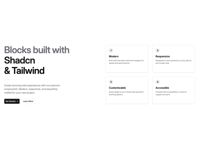
Feature 231 block design & features
Feature231 is a two-column marketing block built with Shadcn UI button components. The left column stacks a dramatic multi-line title with muted lead-in lines, a short horizontal rule, intro copy, and two actions. The right column is a responsive grid of bordered cards on a raised card surface, each showing a numbered circle, feature title, and small muted description.
Default theming keeps background and card surfaces flat with light borders and soft shadow on each card. Primary color appears in the numbered badges and headline accent text. Density is generous on large screens with a wide gap between columns, while cards stay readable in one or two columns on smaller breakpoints. Hover-style transitions on cards add a slight lift without heavy motion.
This reads as a confident product marketing layout: big type, clear numbering, and explicit CTAs. It is moderate complexity driven by structured copy arrays and repeatable card markup rather than illustration or video. The numbered grid is a common pattern but the split headline treatment and dual buttons make it feel more complete than a bare list.
Below the large-screen two-column layout, content stacks into a single column with the headline block first and the numbered cards following, still in a wrapping grid.