
Stats 2 block design & features
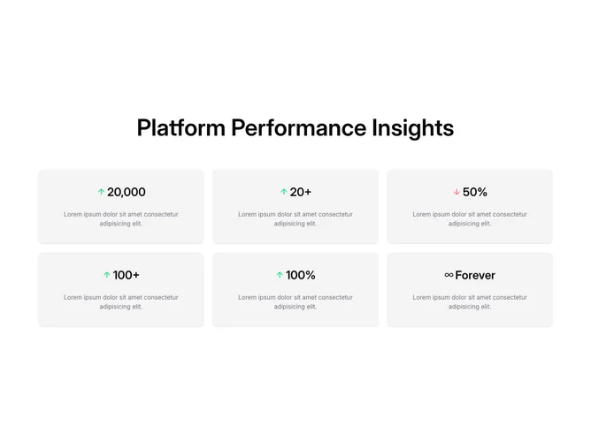
Stats2 is a Shadcn UI stats section with a centered heading above a six-card grid in three columns. Each card shows a value next to a trend icon (up arrow, down arrow, or infinity) and a muted supporting sentence.
Cards use a borderless accent fill with roomy padding. Up trends are marked in green and the down trend in red, so the icons carry the only color. Values sit at a medium-large weight rather than display scale. The grid is compact compared with an open number row. Static.
The look is a dashboard-adjacent marketing grid: cards plus directional arrows instead of bare numerals. It is still a standard pattern, closer to a shadcn-default card set than a custom composition. Complexity stays simple and content-driven; you need six values, trend directions, and short descriptions.