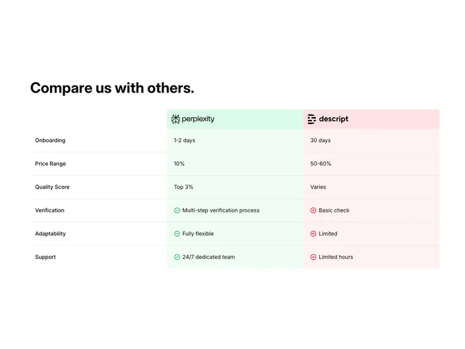
Compare 1 block design & features
Compare1 renders a client-side comparison table laid out as a grid that matches common Shadcn UI spacing and surface colors, wrapped for horizontal scrolling on narrow viewports. A bold title introduces the section; inside, three fixed columns label the feature name, then present two company logos against soft green and red header backgrounds. Following rows iterate onboarding timing, pricing spread, quality score, verification depth, adaptability, and support cadence, with the first three rows showing text only and later rows prefixing green check and red octagon icons beside the cell copy for the left and right offerings respectively.
Color cues lean on pastel green and pink-red row backgrounds so the two sides stay visually separated without hard separators between every line. Typography keeps row labels semibold and body values at comfortable reading size with extra padding on wide screens.
The block is moderately elaborate because of the colored header band, icon logic, and scroll container, yet the data model is a single array you can remap to your own criteria. It is a common marketing comparison pattern elevated slightly by explicit pro/con iconography on the lower rows.
The layout enforces a minimum width, so small phones rely on sideways scrolling rather than collapsing to a card stack.