Changelog 6 block design & features
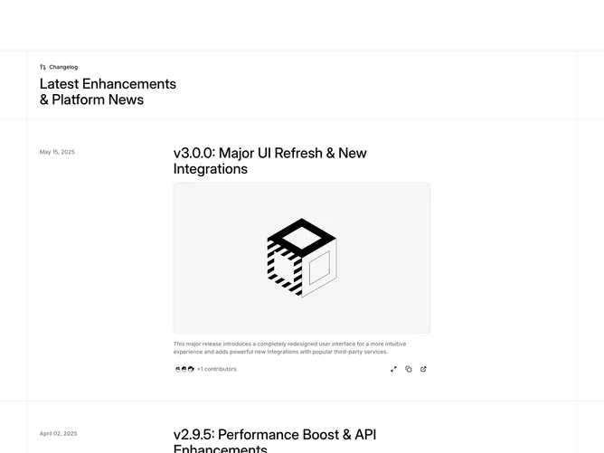
Changelog6 is a structured release index built with shadcn/ui tooltips and overlay content. A pull-request icon and medium-weight page title sit above rows divided by full-width hairline rules; each row keeps the publish date in a narrow column, then stacks a large title, full-bleed preview image that opens the long-form story, muted excerpt, overlapping contributor thumbnails with an overflow count, and a cluster of subtle icon actions.
The expanded view repeats title, excerpt, art, and then drops into extensive prose with headings, lists, block quotes, and tables suited to major announcements. Contributor lists can run long, with overflow summarized numerically beside the avatar stack.
This layout targets teams that need a scannable index but still want room for tables and quotes in the full write-up. It is visually restrained (outlined container, minimal chrome) while behaviorally rich.
On compact widths the two-column date and body relationship compresses, yet the image, excerpt, avatars, and actions stay grouped in one vertical flow per release.