Timeline 4 block design & features
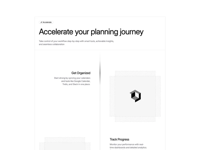
The component is a structured layout tool designed to streamline planning processes by showcasing a sequence of informational blocks. Each block highlights a specific capability, featuring a title, a descriptive text, and an illustrative image, making it straightforward for users to grasp the component's functionality swiftly. This shadcn component stands out by integrating organizational features, progress tracking, and collaboration tools, all encapsulated within a visually appealing timeline format.
Delving deeper, this shadcn block allows for intricate design aesthetics, such as the use of alternating block orientations that enhance visual dynamism. Each element is carefully arranged to facilitate easy navigation and comprehension. The inclusion of icons and images further enriches the user experience by providing immediate visual cues. The component uses containerized card structures with badges and icons, adding emphasis to the features and enhancing legibility. Moreover, its seamless integration of varied content types ensures that diverse informational needs are met efficiently.