
Shadcn Team Blocks

Browse 38+ Shadcn UI Team sections built with React, Tailwind CSS and shadcn/ui. Copy & paste the code or install via the shadcn CLI.

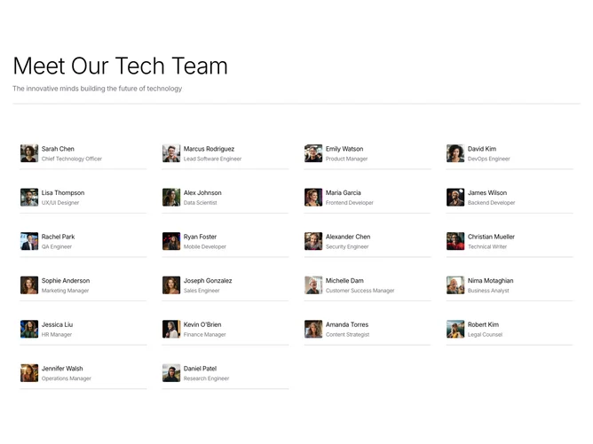
Shadcn Team 11 - Team grid with hover bio highlight

Team grid with hover bio highlight

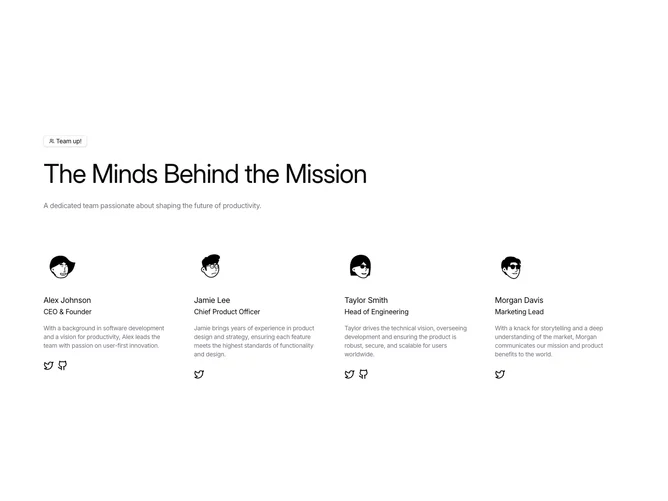
Shadcn Team 4 - Team grid with bios and social links

Team grid with bios and social links

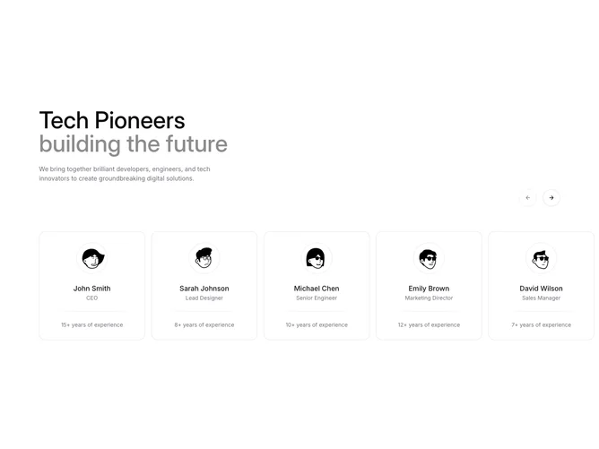
Shadcn Team 8 - Team carousel with experience callouts

Team carousel with experience callouts

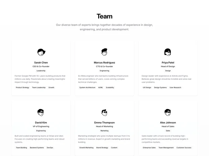
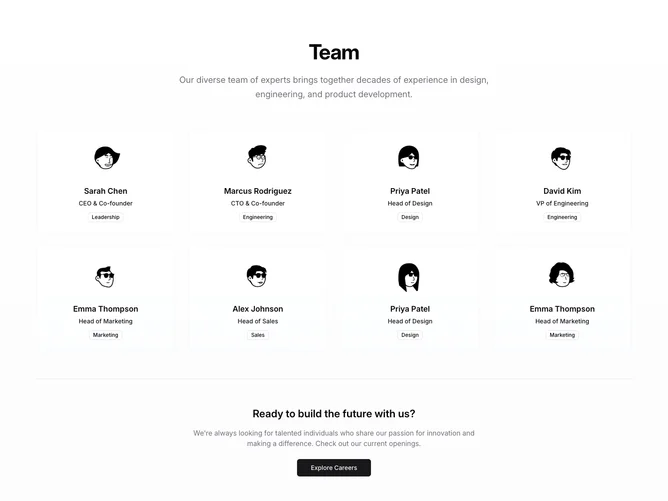
Shadcn Team 5 - Team cards with expertise badges and careers CTA

Team cards with expertise badges and careers CTA

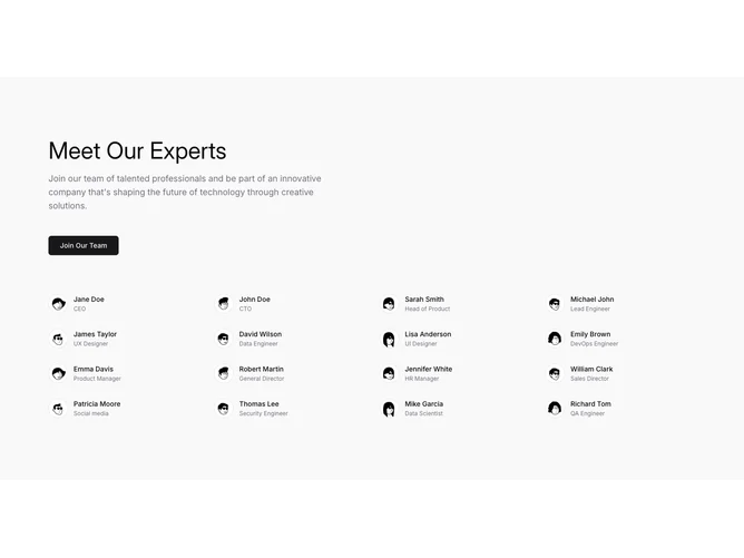
Shadcn Team 10 - Experts list grid with join CTA

Experts list grid with join CTA

Shadcn Team 6 - Compact team cards with department badges

Compact team cards with department badges

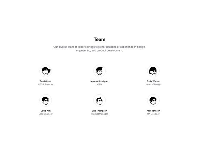
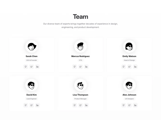
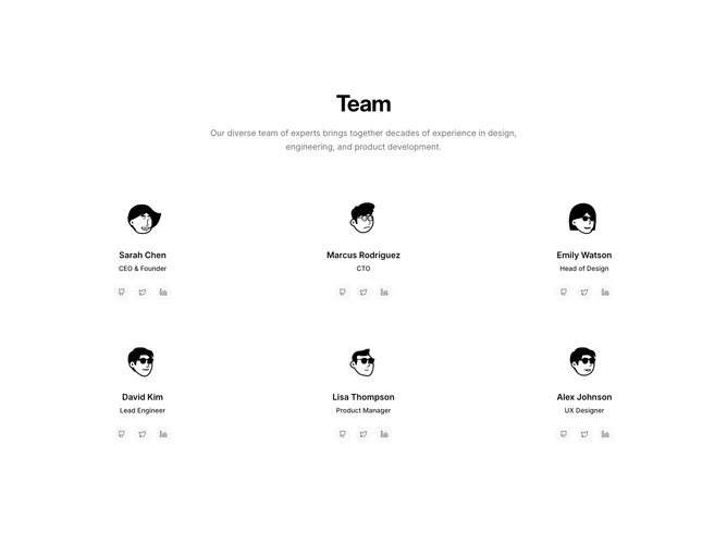
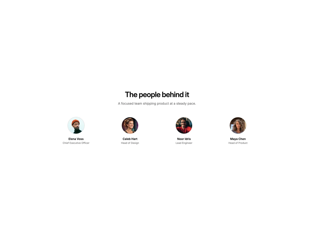
Shadcn Team 1 - Centered team grid with avatars

Centered team grid with avatars

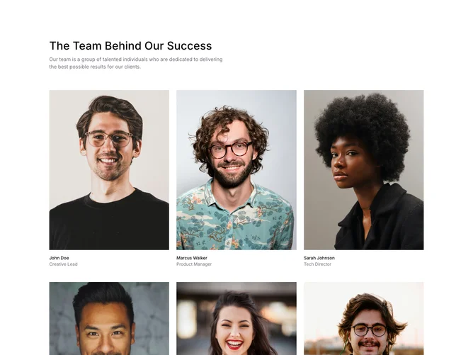
Shadcn Team 36 - Simple team photo grid

Simple team photo grid

Shadcn Team 13 - Animated team portraits with mobile carousel

Animated team portraits with mobile carousel

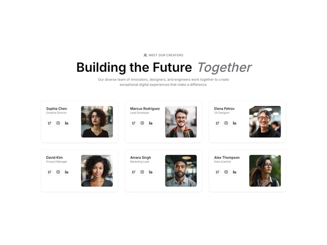
Shadcn Team 15 - Split team cards with social buttons

Split team cards with social buttons

Shadcn Team 3 - Hover-lift team cards with gradient accents

Hover-lift team cards with gradient accents

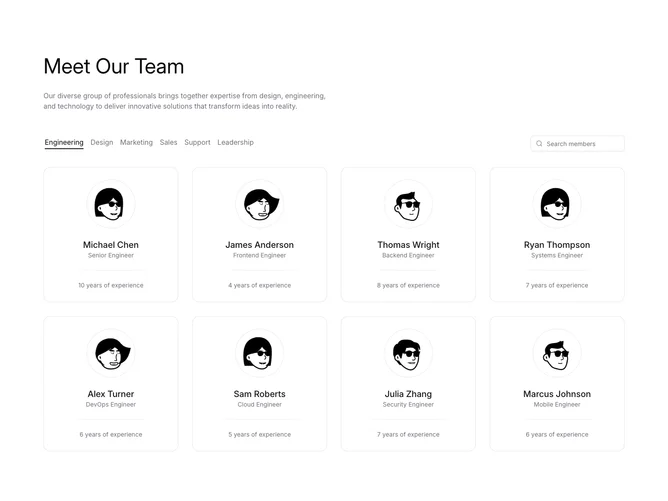
Shadcn Team 9 - Filterable team grid with tabs and search

Filterable team grid with tabs and search

Shadcn Team 2 - Team grid with social profile links

Team grid with social profile links

Shadcn Team 7 - Portrait grid with names and roles

Portrait grid with names and roles

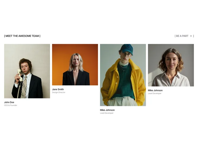
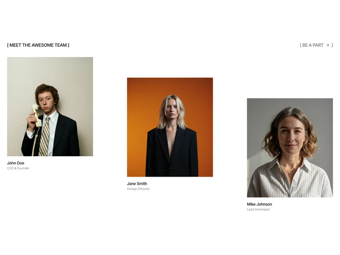
Shadcn Team 12 - Staggered portrait trio with bracket header

Staggered portrait trio with bracket header

Shadcn Team 14 - Split hiring panel with team photo row

Split hiring panel with team photo row

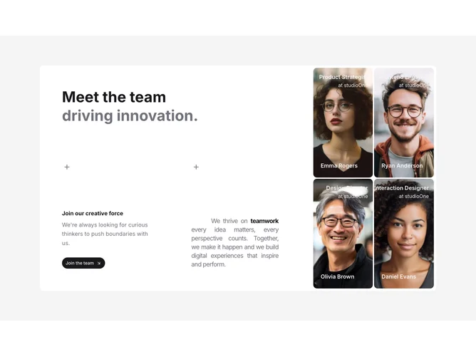
Shadcn Team 16 - Mission panel with full-bleed portrait grid

Mission panel with full-bleed portrait grid

Shadcn Team 17 - Team portraits with alumni and culture sections

Team portraits with alumni and culture sections

Shadcn Team 18 - Categorized team directory with bio popovers

Categorized team directory with bio popovers

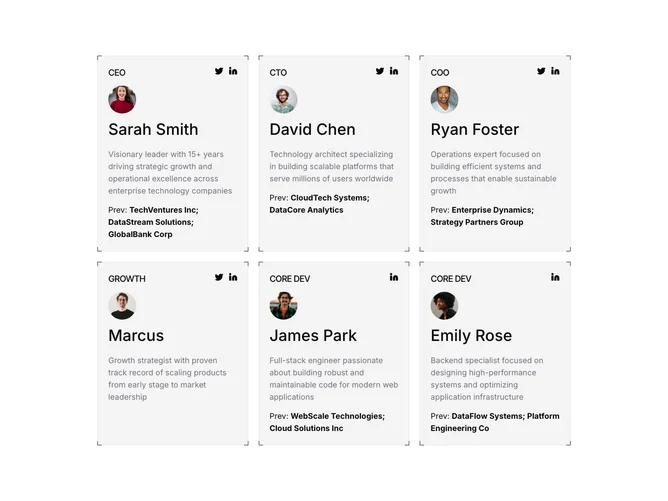
Shadcn Team 19 - Corner-framed team profile cards

Corner-framed team profile cards

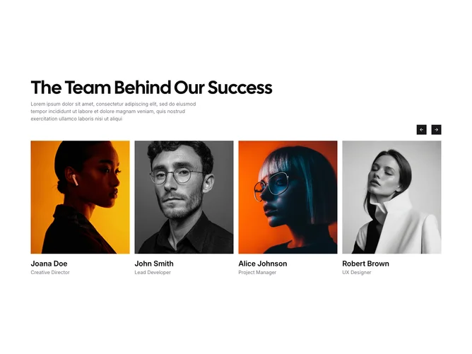
Shadcn Gallery 27 - Team member carousel

Team member carousel

Shadcn Team 37 - Centered circular avatar row

Centered circular avatar row

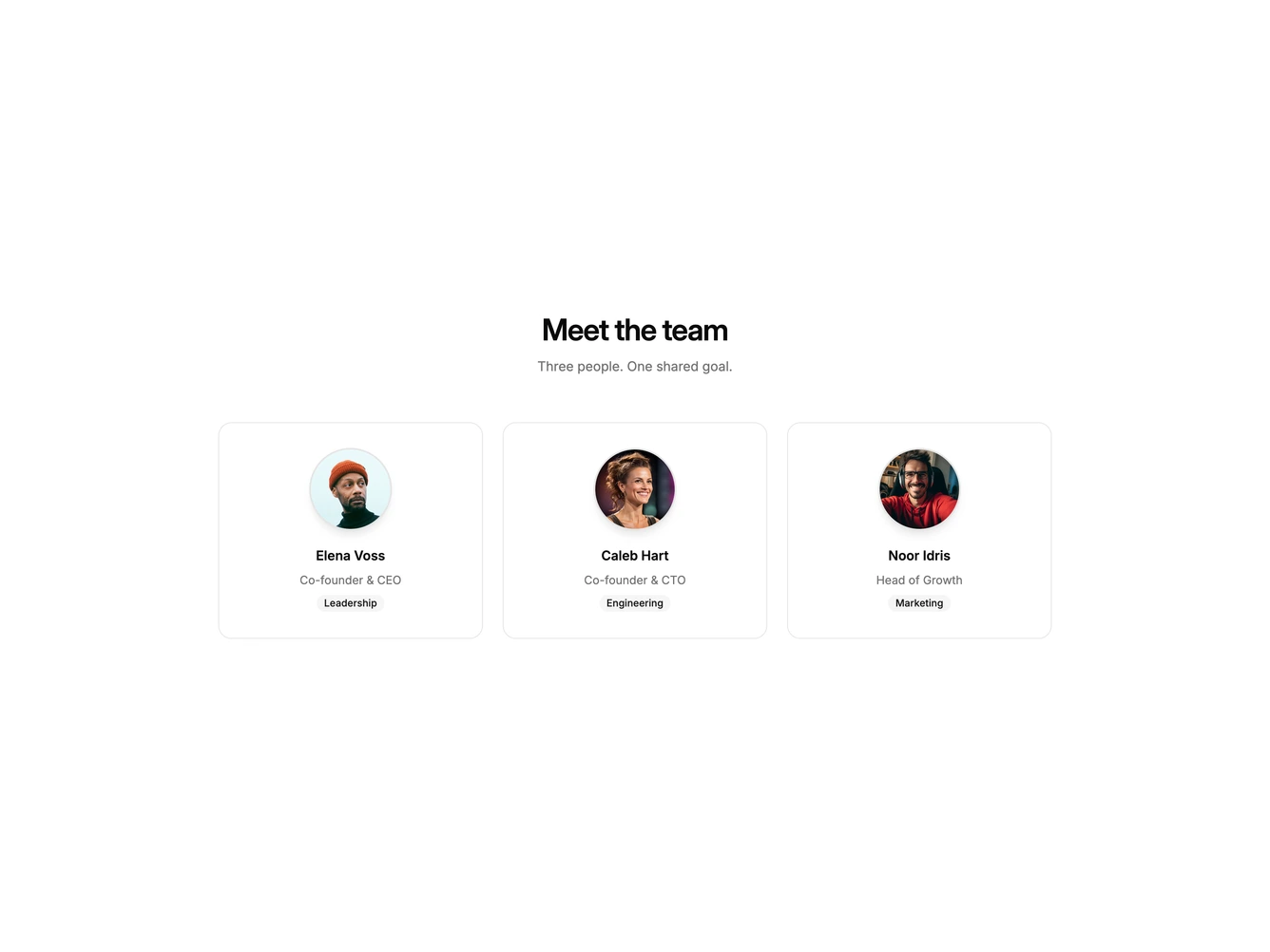
Shadcn Team 38 - Founder cards with department badges

Founder cards with department badges

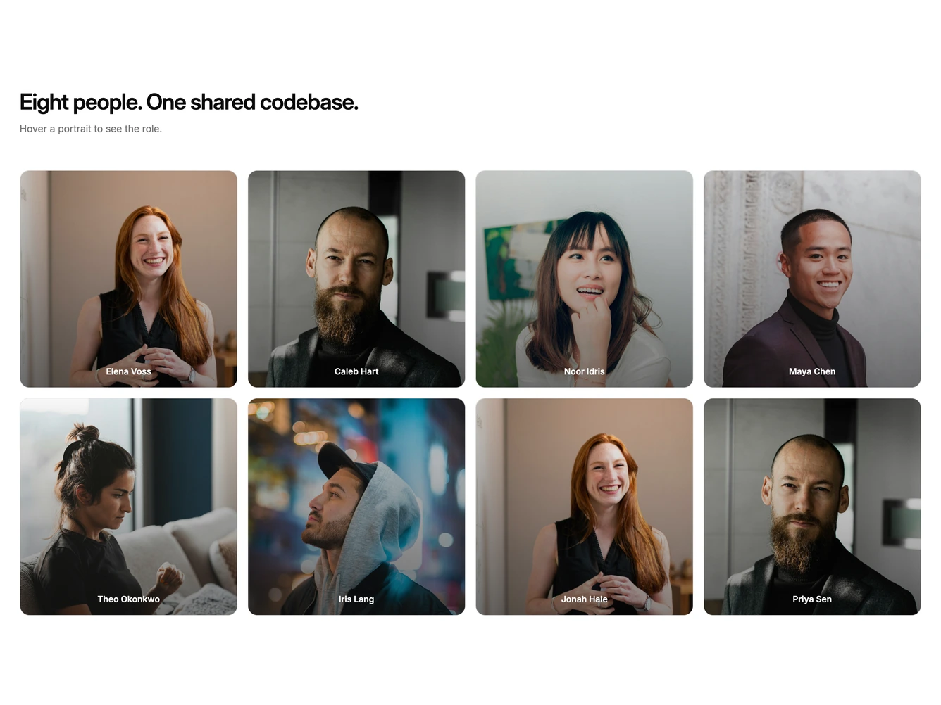
Shadcn Team 39 - Hover overlay portrait grid

Hover overlay portrait grid

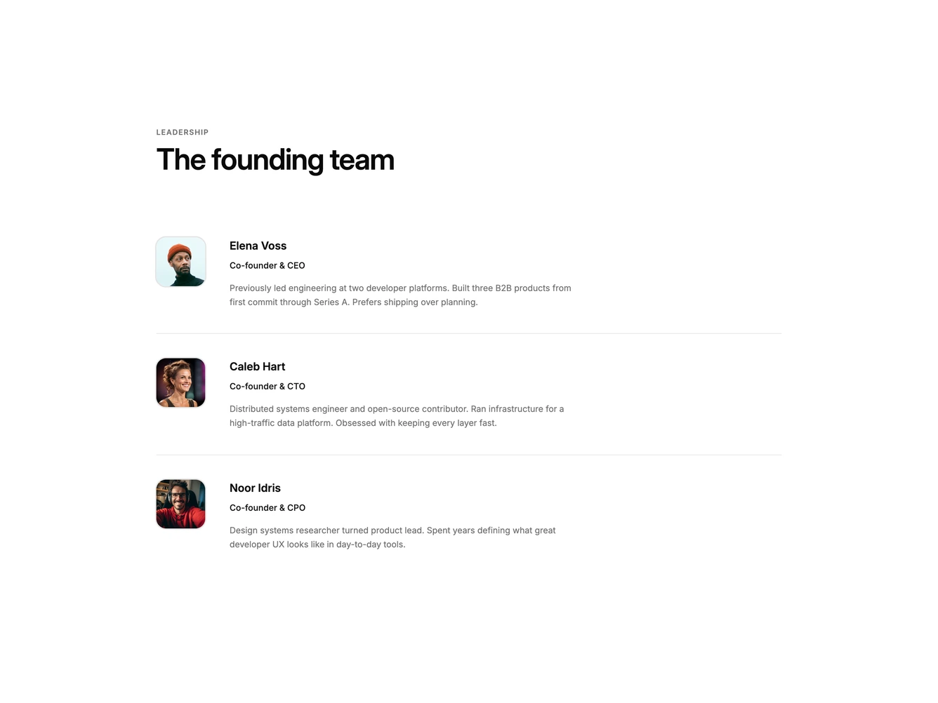
Shadcn Team 40 - Founding team bio list

Founding team bio list

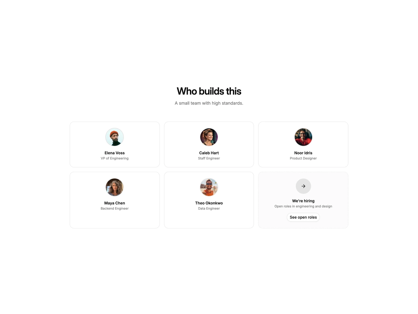
Shadcn Team 41 - Team grid with hiring card

Team grid with hiring card

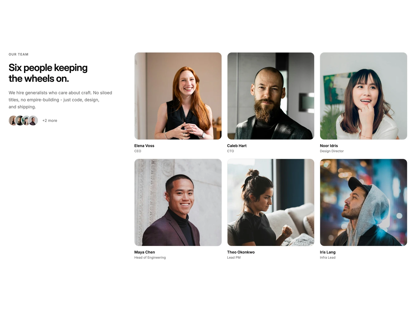
Shadcn Team 42 - Sticky intro with portrait grid

Sticky intro with portrait grid

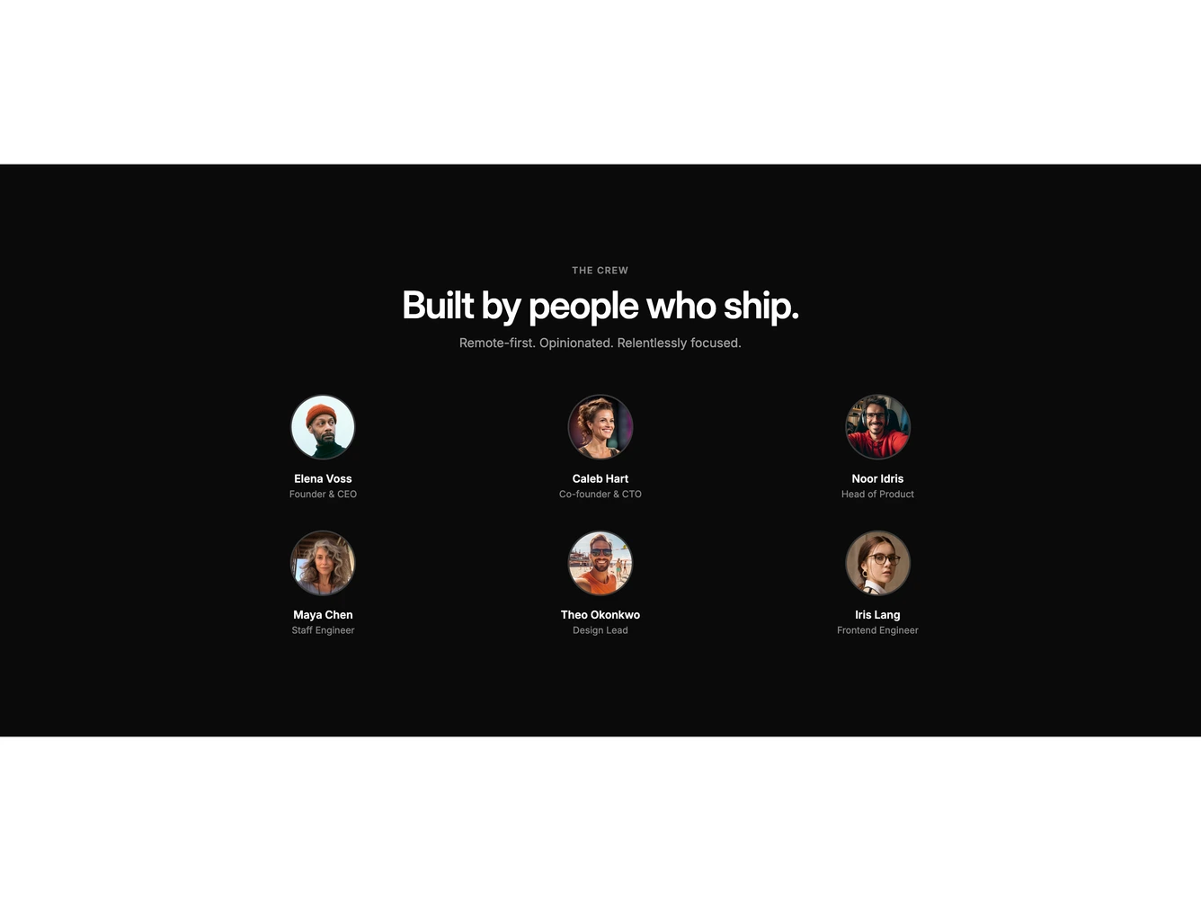
Shadcn Team 43 - Inverted remote crew grid

Inverted remote crew grid

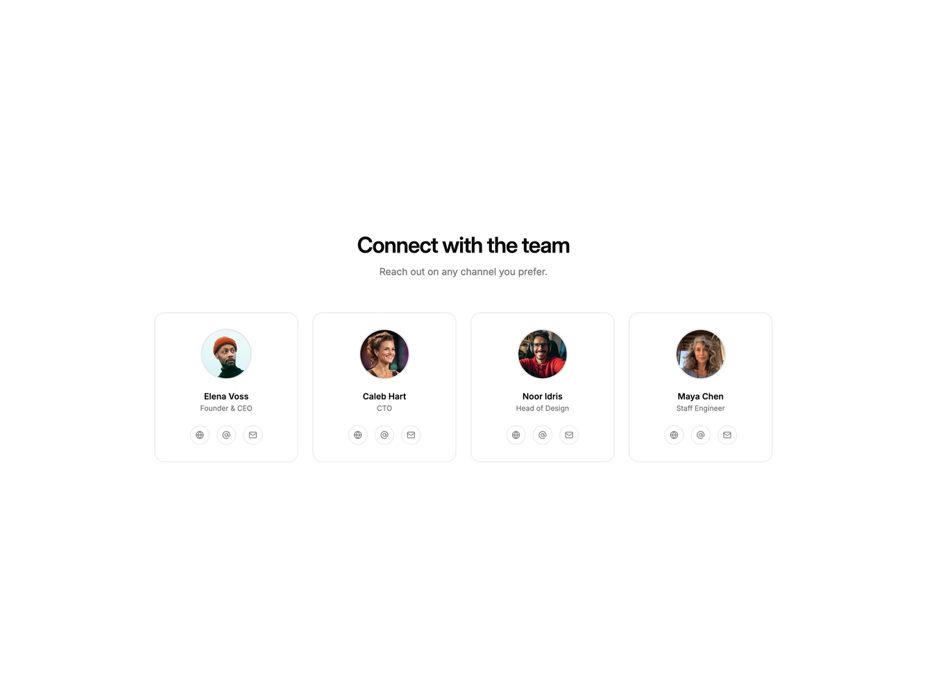
Shadcn Team 44 - Team cards with contact links

Team cards with contact links

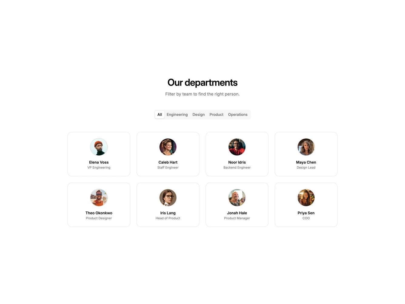
Shadcn Team 45 - Filterable department team grid

Filterable department team grid

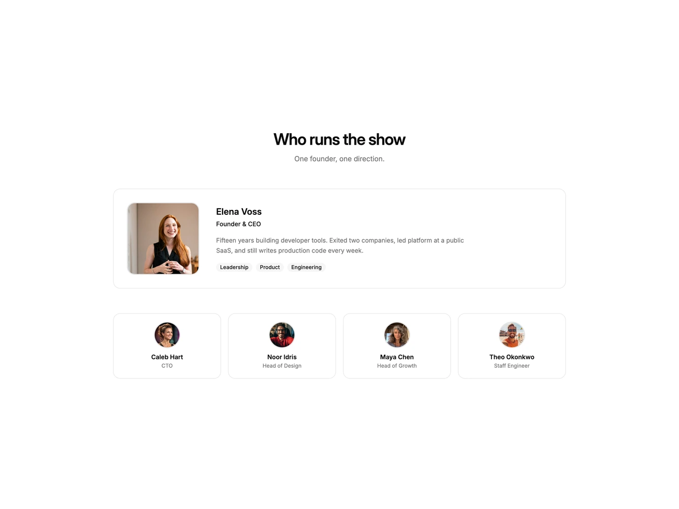
Shadcn Team 46 - Featured founder with supporting team

Featured founder with supporting team

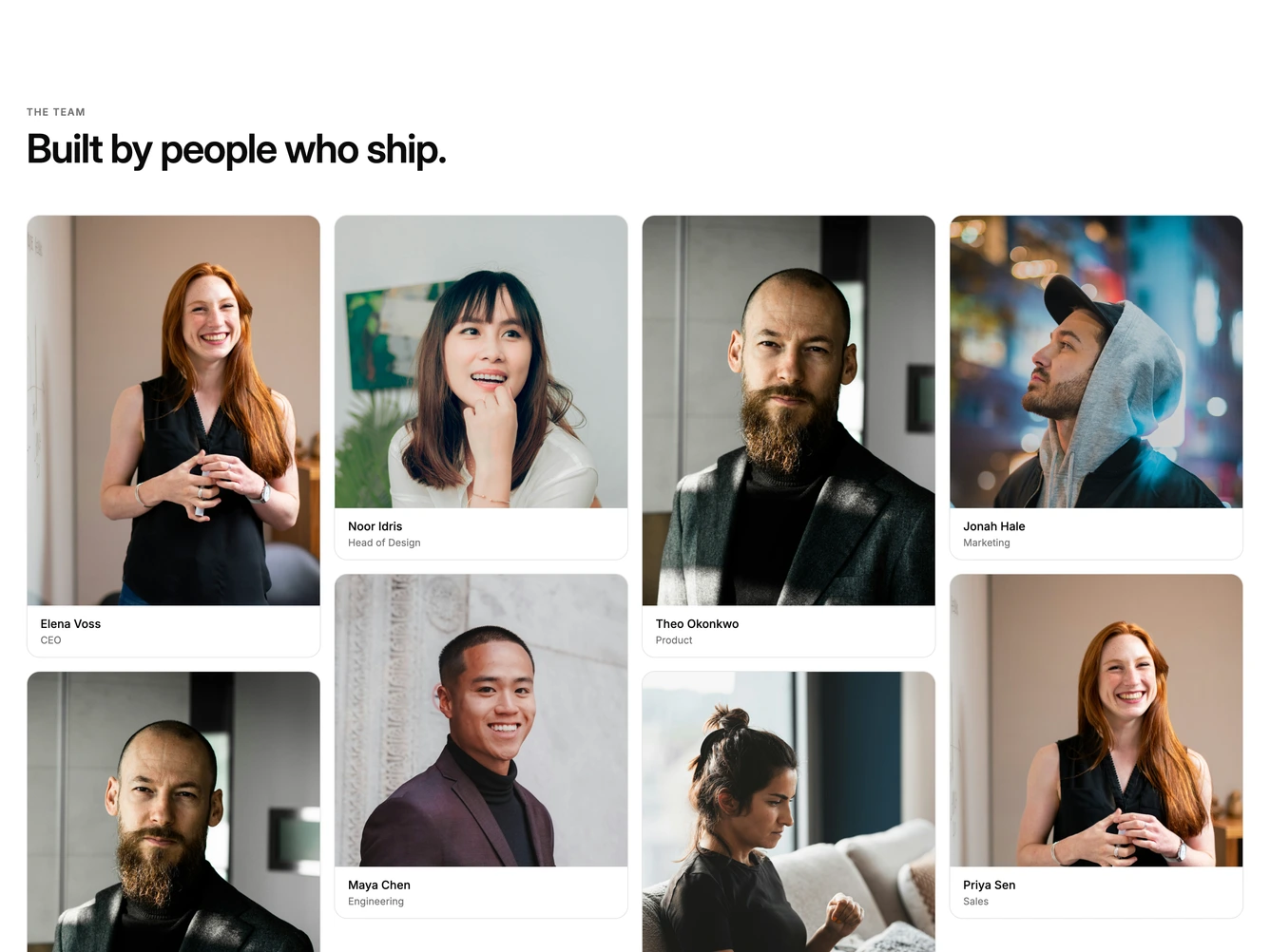
Shadcn Team 47 - Masonry team portrait columns

Masonry team portrait columns

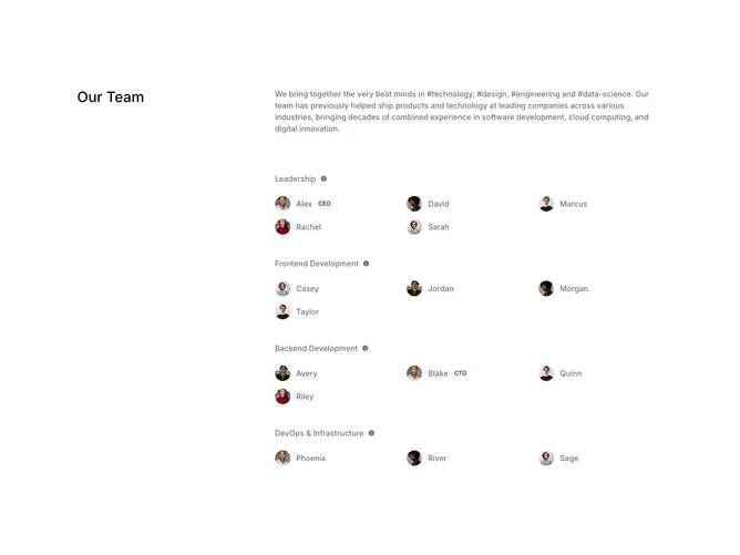
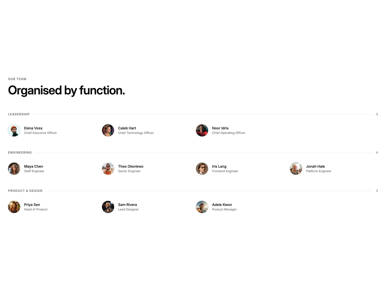
Shadcn Team 48 - Team directory by department

Team directory by department

Shadcn Team 49 - Team directory list with avatars

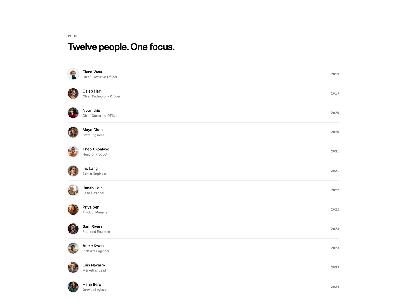
Team directory list with avatars

Shadcn Team 50 - Distributed team location cards

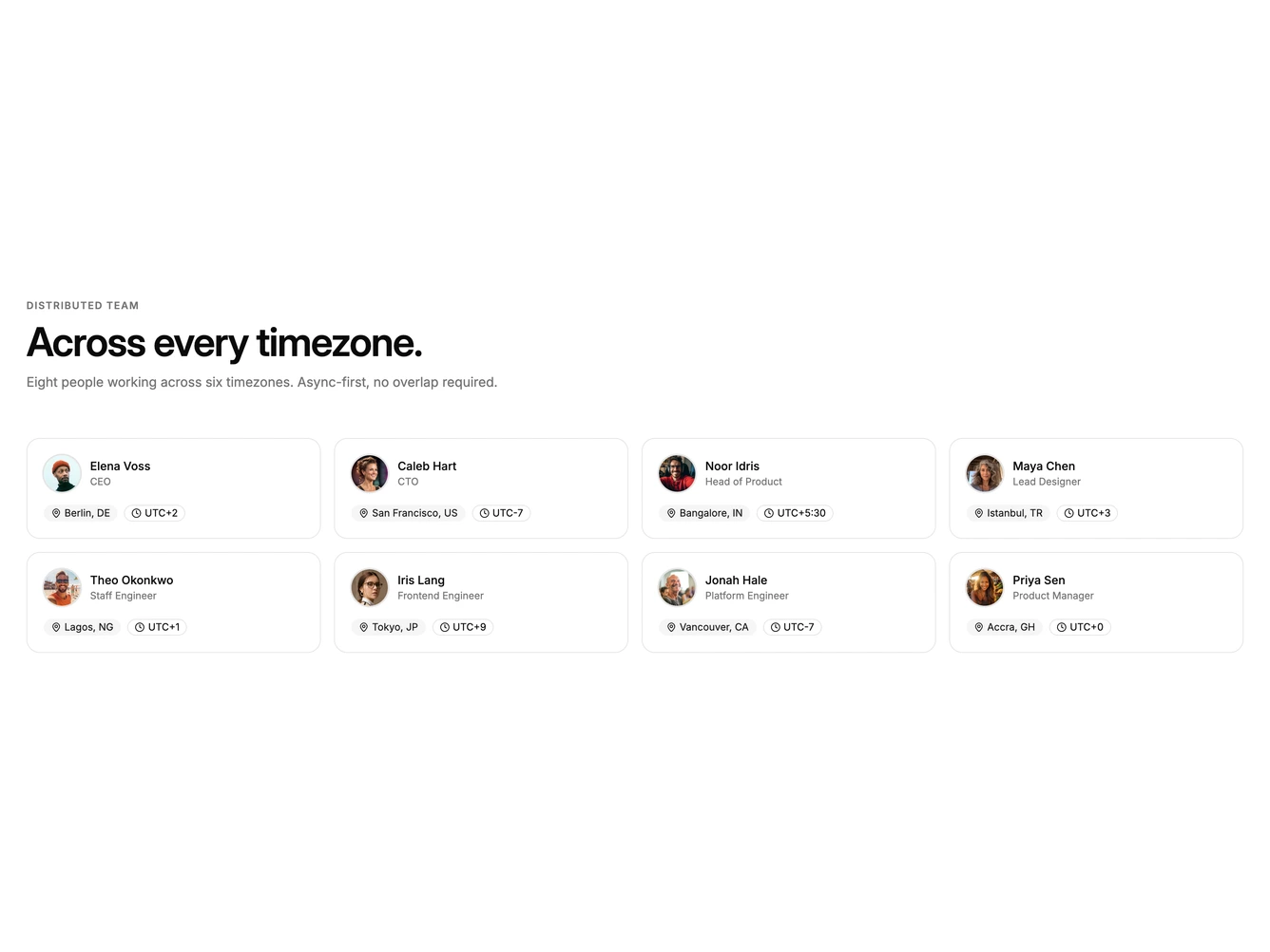
Distributed team location cards

Shadcn Team 52 - Team member card carousel

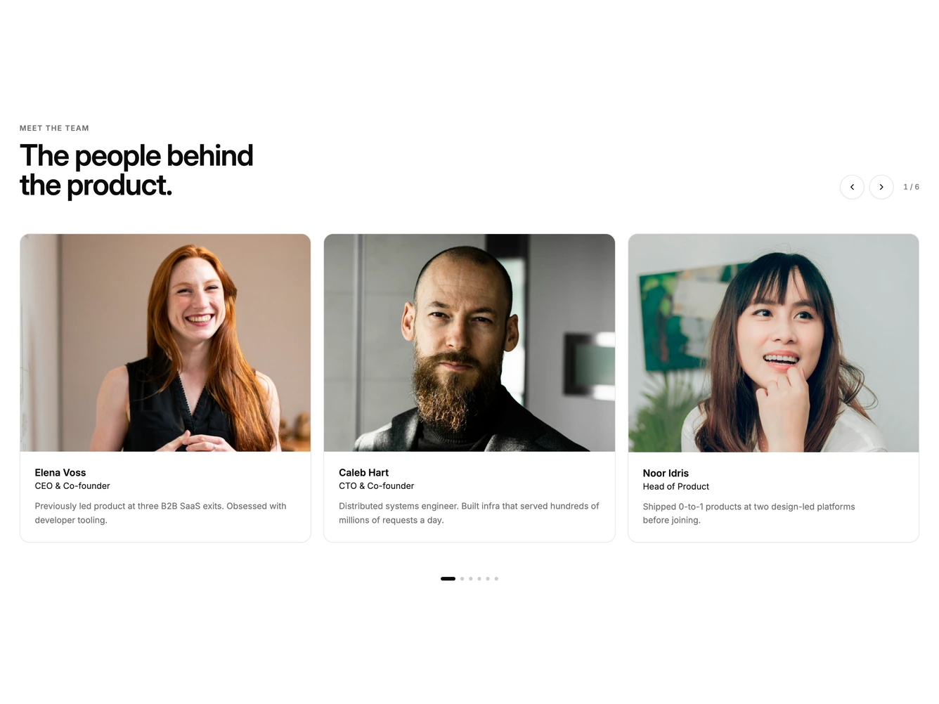
Team member card carousel

Shadcn Team 53 - Founder quote beside team grid

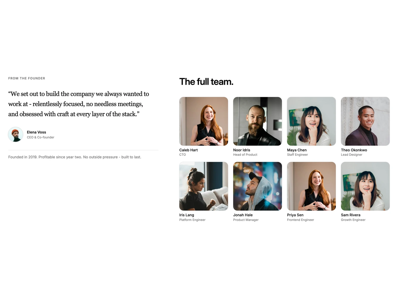
Founder quote beside team grid

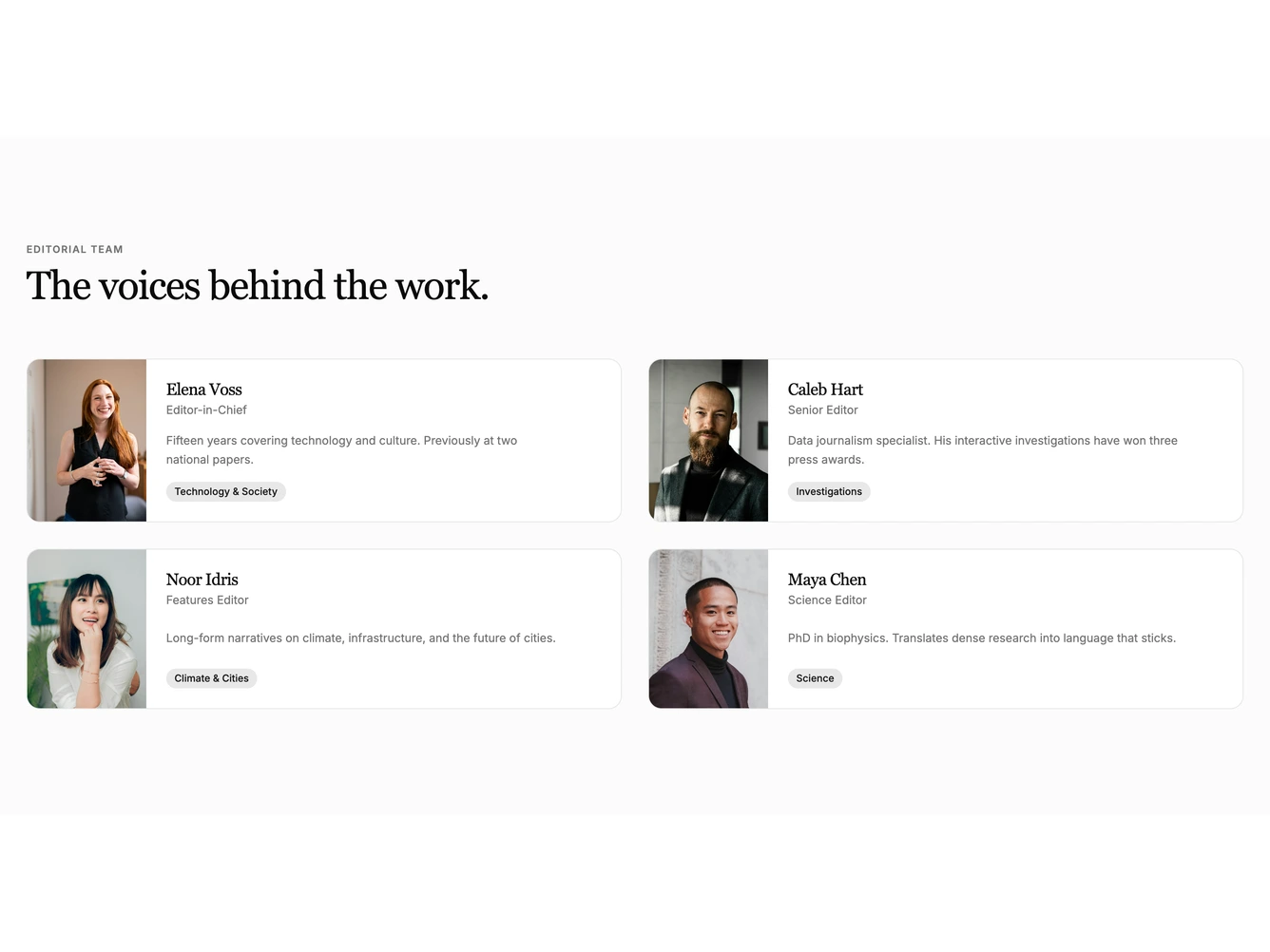
Shadcn Team 55 - Editorial team portrait cards

Editorial team portrait cards

Shadcn UI Team Blocks, Sections & Components

Team blocks are dedicated sections of a webpage focused on team content. They appear on landing pages, product pages, and marketing sites as key elements that communicate value and drive user engagement.

Each block is a self-contained React component which you can copy/paste the code or install via the shadcn CLI. You own the code and can modify however you like, or us AI and LLMS to quickly change the design.

Our team blocks combine headlines, supporting text, images, icons, CTA buttons, and responsive layouts. Each block is designed with clear visual hierarchy and consistent spacing to integrate seamlessly into any page structure.

Choosing the Right Team Section

Different goals call for different team sections. We’ve organized our team blocks into subgroups so you can find the right layout for your use case:

  • Shadcn Team Grid - Uniform avatar and card grids with consistent sizing, names, and roles.
  • Shadcn Team Directory - List and org-chart team layouts grouped by name, role, department, or join year.
  • Shadcn Team Portraits - Photo-led team sections with large square or tall portraits, masonry, and hover overlays.
  • Shadcn Team Carousel - Paged or swipeable team sliders that show a few people at a time.
  • Shadcn Team Split - Two-column team sections pairing a sticky story, quote, or hiring panel with a roster.
  • Shadcn Team Filter - Team grids with department tabs or search that filter the visible people.

FAQs

What is a Shadcn Team section?

A shadcn Team section is a React block for a marketing page. Shadcnblocks Team sections are built with Tailwind and shadcn/ui.

How do I install a Shadcnblocks Team block?

Two ways. Copy and paste the code from the block page (in the code view), or install with the shadcn CLI. For example to install with the CLI run npx shadcn add @shadcnblocks/team11 - See the installation docs for setting up shadcn/ui if your project isn't using it already.

Can I use Shadcnblocks Team sections in Next.js or Astro?

Yes. Shadcnblocks work with any React project. That includes Next.js, Astro, Remix, and Vite.

Do Shadcnblocks Team blocks work with Radix UI and Base UI?

Yes. Our blocks support both Base UI and Radix UI. They will use whatever primitive library you have defined in your project's components.json. You can find more info at Base UI or Radix UI .

Can I customize Shadcnblocks Team sections?

Yes. You can customize every aspect of the code. Shadcnblocks are downloaded as components that live in your codebase (not npm modules), so editing the code is just like your own code.

How does theming work on Shadcnblocks Team components?

Our blocks use shadcn/ui theme variables in Tailwind CSS. CSS variables cover light mode, dark mode, and the rest of the shadcn design tokens. You can install any theme from our Shadcn Themes page.

How do I choose the right Shadcn Team section?

Use the subgroup list above. Start from the layout you already have assets for, then change the copy and the image.