
Team 16 block design & features
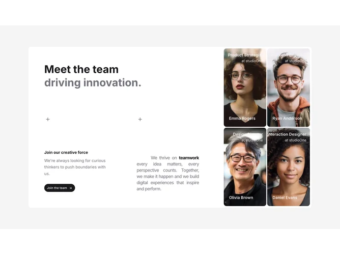
Team16 is a split team story section built with shadcn/ui card layout. A wide text column presents a bold-plus-normal headline, mission title and description, a CTA button, and collaboration copy with emphasized keywords and plus icons. Beside it, a portrait grid shows full-bleed images with role or company overlays and names anchored toward the bottom, plus a small plus mark in the corner of each tile.
Light card shell with strong contrast between textual storytelling and image tiles. Portraits are tall and immersive. Overlay labels stay compact so photos remain dominant. Static layout focused on composition.
Premium and brand-story oriented rather than a simple directory. Elaborate complexity from mixed narrative content and multiple high-impact portraits. Content-driven on the left and image-driven on the right.
Stacks to a single column on smaller screens with the mission panel above the portrait grid.