

Shadcn Team Split Blocks

Browse and download 5+ Shadcn UI Team Split blocks. Built with React, Tailwind and shadcn/ui. These shadcn components are ready to download, copy and paste or install with the shadcn registry.

Shadcn Team 14 - Split hiring panel with team photo row

Split hiring panel with team photo row

Shadcn Team 16 - Mission panel with full-bleed portrait grid

Mission panel with full-bleed portrait grid

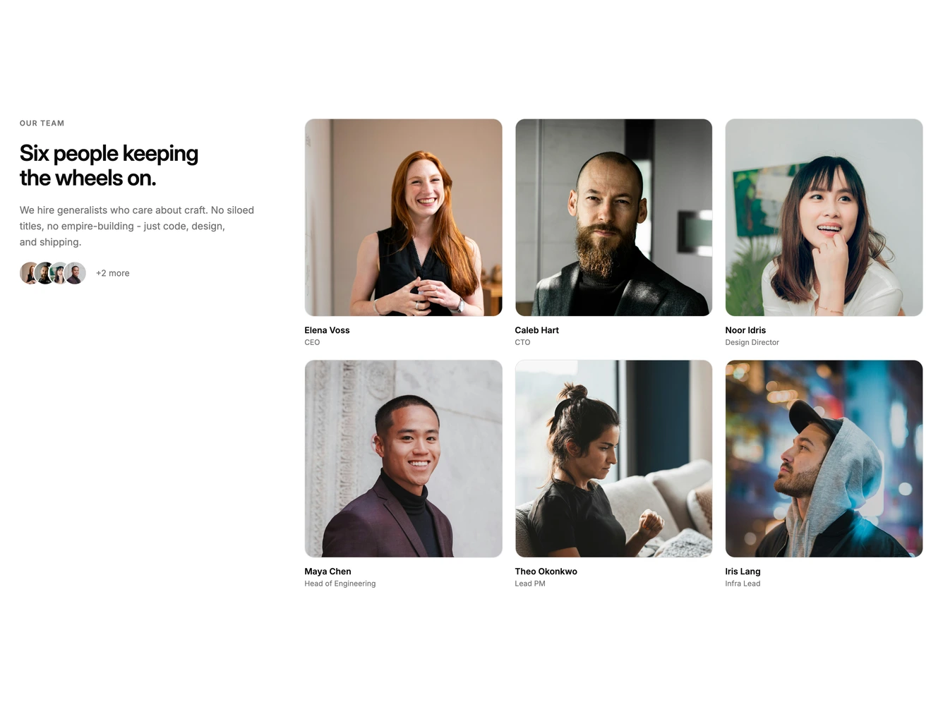
Shadcn Team 42 - Sticky intro with portrait grid

Sticky intro with portrait grid

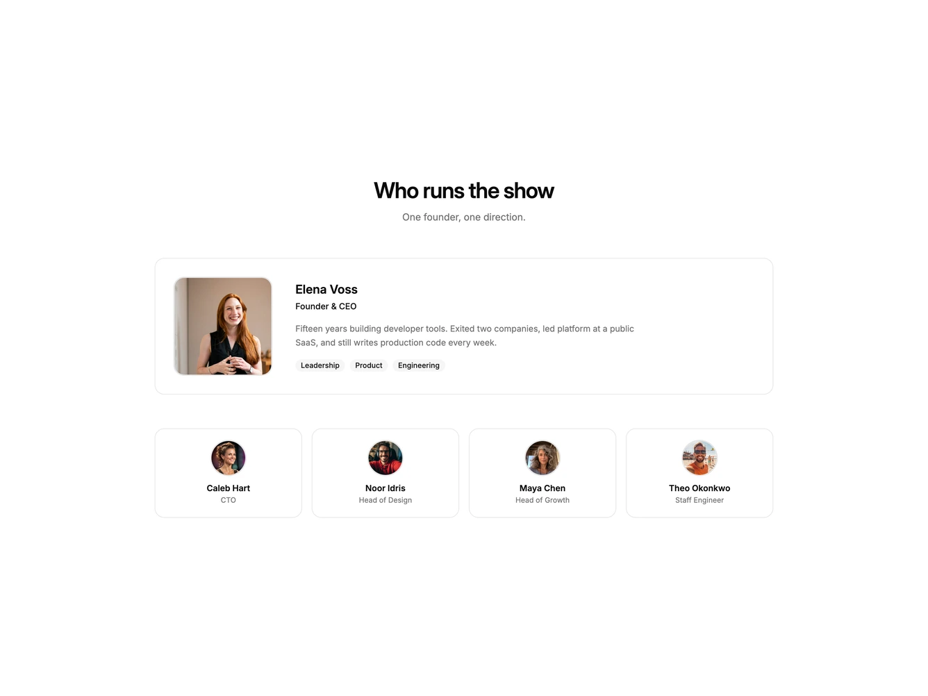
Shadcn Team 46 - Featured founder with supporting team

Featured founder with supporting team

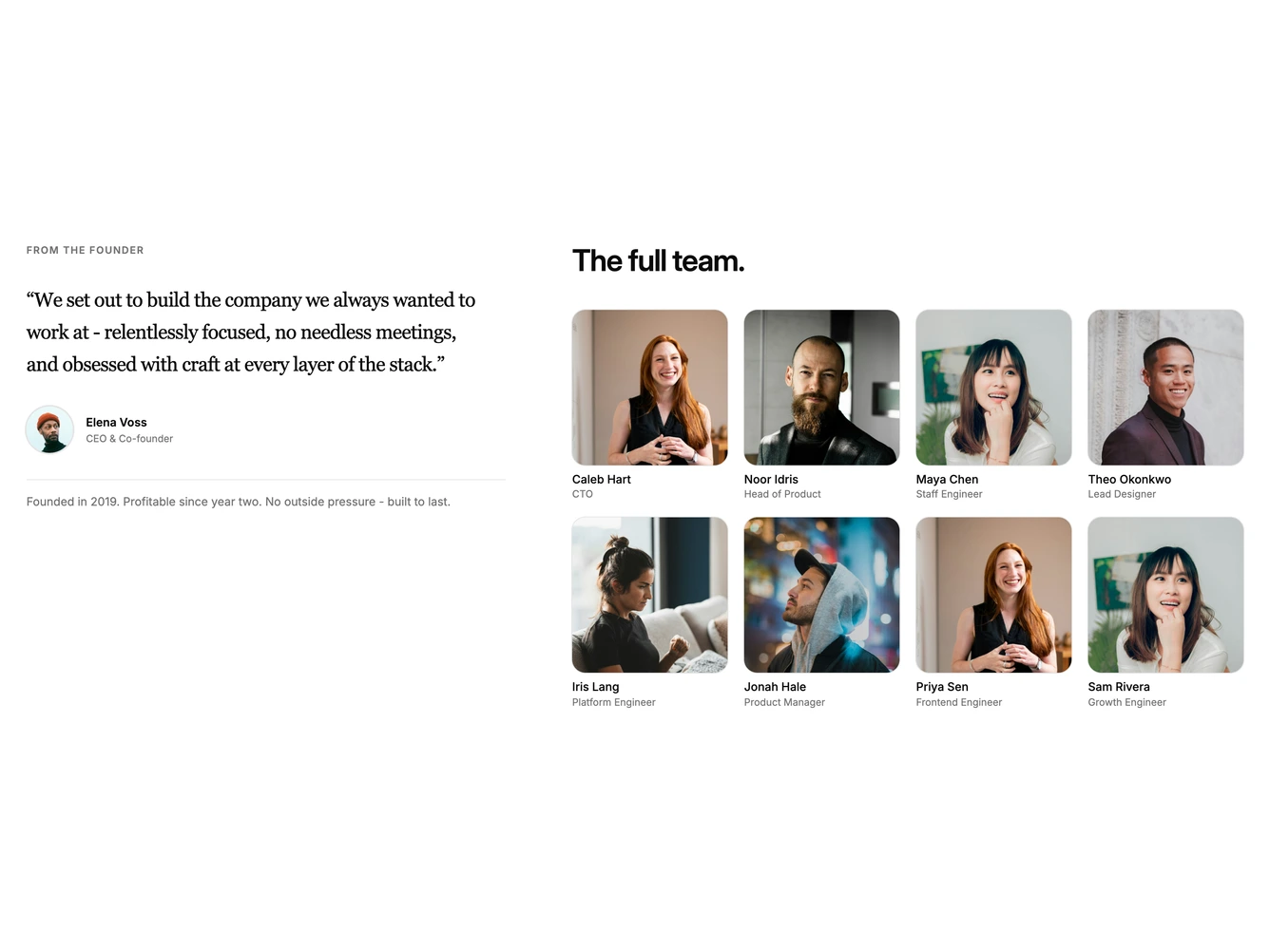
Shadcn Team 53 - Founder quote beside team grid

Founder quote beside team grid

Shadcn Team Split Blocks, Sections & Components

A shadcn team split block uses a split layout with content on one side and imagery or supporting elements on the other. This two-column approach creates visual balance between text and visuals.

Each block is a self-contained React component which you can copy/paste the code or install via the shadcn CLI. You own the code — customize the layout, content, and styling using Tailwind utility classes.