
Team 6 block design & features
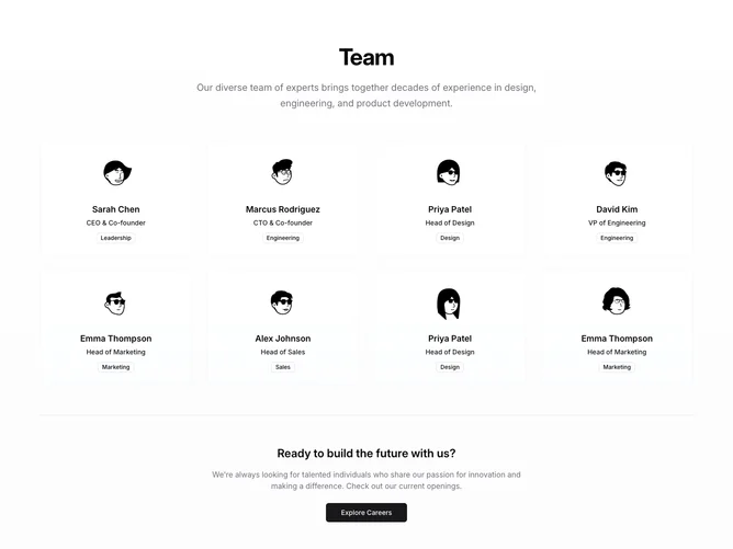
Team6 is a compact team grid built with Shadcn UI. A centered heading, description, and careers button sit above bordered member cards. Each card shows an avatar, name, role, and an outline department badge, with a muted hover wash on the card surface. A bottom careers CTA mirrors the header action.
Light background with tighter cards than richer bio layouts. Borders and hover tint provide structure without heavy shadows. Typography stays small and scannable. Static aside from hover.
A practical hiring roster with less narrative depth than bio-heavy variants. Moderate complexity still, mainly content-driven across many members and department labels.
The grid expands from one column to two on medium screens and four on large screens.