Team 36 block design & features
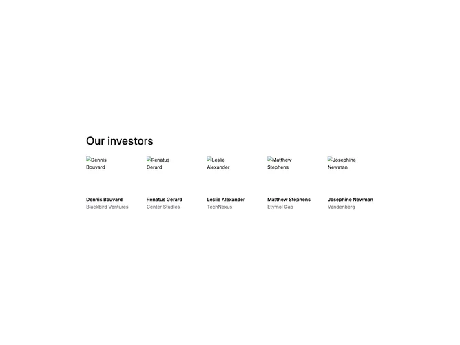
Team36 is a simple team or investors grid section with a heading and a responsive grid of member cards. Each card displays a square photo, the person's name, and their role or company. The grid adapts from 2 columns on mobile to 5 columns on large screens.
The visual treatment is minimal with no card backgrounds or borders. Photos are displayed at a fixed size (size-30) with object-cover for consistent dimensions. Names use semibold weight while roles use muted foreground color for hierarchy. The heading uses medium weight with wide tracking for a distinctive look.
This team grid follows the mainline design system with its clean, unadorned layout. The constrained max-width (max-w-5xl) keeps the grid compact and readable. The section works well for displaying investors, advisors, or team members without heavy visual treatment.
The responsive grid starts at 2 columns and progressively adds columns at each breakpoint up to 5 columns on large screens. Generous gap spacing (gap-12) provides breathing room between items.