Team 3 block design & features
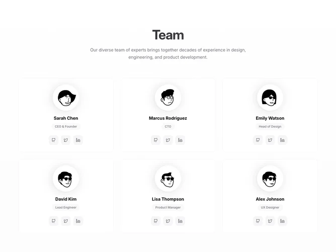
The Team3 component is designed to elegantly present a group of professionals with a sophisticated layout. It features multiple team members, each displaying their roles, names, avatars, and links to their social media profiles if available. This section stands out with its visually appealing design using smooth hover effects and gradients that add dynamism and depth to the user interface.
This shadcn block is highly customizable and adaptable for presenting structured information about team members. Each member is featured in individual cards that include a gradient overlay on hover, a prominent avatar, and a series of social media icons. Through finely tuned CSS transitions and transformations, the interactive cards offer an engaging user experience. This block not only visually distinguishes each team member but also emphasizes their importance through clean text and concise role descriptions.