
Team 15 block design & features
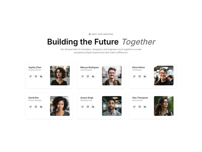
Team15 is a team card grid built with Shadcn UI card and button components. A centered header uses a users icon label, split title lines, and subtitle. Each card splits horizontally: left side holds name, role, and outline social buttons for Twitter, Instagram, and LinkedIn; right side is a full-height square portrait.
Light cards with clear left-right split and restrained social chrome. Portraits are square rather than circular, giving a more editorial crop. Hover states stay subtle on the outline buttons. Static overall.
Modern and polished without heavy decoration. Moderate complexity and content-driven: portraits, roles, and social actions. Distinctive for the split card composition versus stacked avatar cards.
The grid grows from one column to two and three across medium and large breakpoints inside a constrained content width.