Feature 144 block design & features
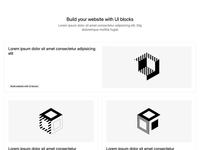
Feature144 organizes Shadcn UI cards under a symmetrical introduction: oversized centered heading with muted explanatory line, then padded card shell splits text column from landscape image capped at moderate height rounding. Subsequent pair mirrors alternating image-text ordering so each sibling shows photograph first or copy first for rhythm while badges repeat across cards as pill outlines.
Neutral surface palette with bordered cards keeps edges crisp yet soft through generous internal padding gaps; typography scales down within cards relative to headline, badges stay muted outlines hugging condensed labels; imagery uses rounded rectangles with object-cover cropping. Shadows stay minimal emphasizing shape blocks over depth tricks; animations default static.
Reads as restrained marketing storyboard with asymmetric pair below hero card for pacing; complexity is modest structurally although current implementation hardcodes headings, badge strings, and imagery inside the component source, so swapping real content requires editing that file rather than passing props. Decorative consistency comes from duplicated heading plus badge scaffold across three slots.
Responsive flow stacks cards vertically narrowing spacing while retaining padding rhythm so alternating image placements still register.