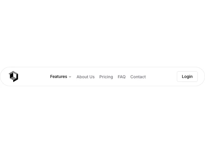
Navbar 6 block design & features
Navbar6 is a floating navigation pill built with Shadcn UI, absolutely positioned near the top center of the page with a capped width, rounded-full border, and translucent background with blur. A square logo mark sits left; desktop links include a Features dropdown with two descriptive items, plus About Us, Pricing, FAQ, and Contact as text links. An outline Login button and animated three-line hamburger sit on the right. Mobile expands a rounded card panel below the pill with dividers, collapsible Features content, and the same links stacked vertically.
The pill reads light and glassy over hero content, with muted link colors that brighten on hover. Dropdown rows slide slightly on hover for micro-motion. The hamburger morphs into an X with a timed transition. Mobile submenu content sits on a soft muted inset panel.
Modern floating-nav aesthetic common on product landing pages where the bar should feel detached from the page edge. Moderate complexity: one dropdown, custom mobile drawer without a sheet component, and blur styling as the main visual hook. Mostly content-driven beyond the pill container.
Because the bar floats, pages typically need top padding so content is not hidden underneath. The mobile menu anchors directly under the pill rather than covering the full viewport.