Compare 8 block design & features
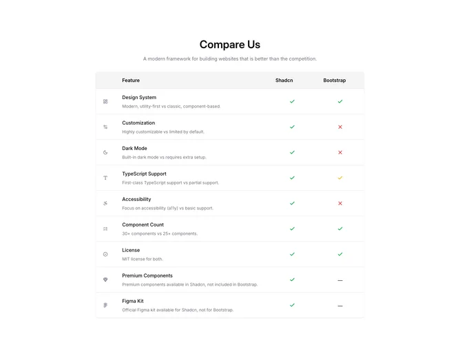
Compare8 presents a feature scoreboard built with Shadcn UI. The head repeats a title and muted tagline, then a rounded bordered panel stacks rows separated by hairline dividers. Desktop shows a header band naming the two columns; each body row begins with a gray-tinted icon, then a label and muted explanation sentence, then paired glyph columns (check in green, partial state in yellow, X in red). Mobile stacks the same content vertically and repeats miniature column captions beside each glyph so the meaning stays tied to logos.
Neutral chrome, gray explanatory text, and simple vector marks keep emphasis on categorical support rather than numbers. Shadows are modest and borders frame the sheet like a worksheet.
Compared with a dense markdown table, this pattern is slightly more expressive because icons annotate each criterion, yet it expects boolean or tri-state judgments rather than free-form paragraphs. Complexity is modest and content-driven once you reconcile how you represent “partial.”
Responsive rules toggle between stacked mobile layout and aligned desktop columns so scanning remains linear on phones and tabular on wide screens.