Feature 175 block design & features
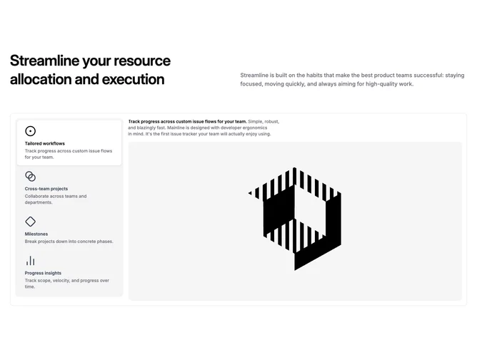
Feature175 pairs a split header with a tabbed workspace built from Shadcn UI Tabs. The top band mirrors many feature sections: a large left-aligned title balances a muted supporting paragraph aligned to the bottom on wide layouts. Below, a rounded frame with a subtle outer border wraps the interactive area. Inside, a vertical list of tab triggers stacks on the left; each trigger shows an icon, feature name, and short helper line. The remaining width becomes a single content stage that updates when a tab is selected.
Muted rail behind the trigger list, crisp background card for the active panel, and a pronounced active shadow on the chosen trigger make state changes obvious without loud color shifts. Typography stays calm: semibold titles, small gray descriptions, and a generous preview image with rounded corners filling the pane. Hover and focus transitions are quick color swaps rather than large motion.
The block feels like restrained product-documentation storytelling: disciplined chrome, predictable hierarchy, emphasis on explanatory imagery. Complexity is moderate: you author parallel sets of headline, prose, thumbnail, and tab metadata rather than juggling many simultaneous widgets.
On narrow screens the tab list and preview stack; the outer frame keeps padding so the section still feels like one component instead of two detached strips.