
Pricing 27 block design & features
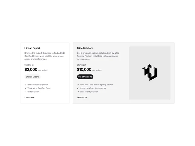
Pricing27 is a services-style pricing pair built with shadcn/ui, laid out as two cards in a responsive grid. The primary offering uses a muted background, reverses to a side-by-side row on medium screens, and can show a large rounded image on extra-wide viewports. It includes a service title, descriptive copy, a starting price with per-project suffix, a pill-shaped primary button, three checklisted benefits, and a text link for more detail. The secondary card is a standard bordered panel with the same price and checklist pattern but a secondary button style.
Typography emphasizes project-based pricing rather than per-seat subscriptions. Buttons use generously rounded shapes, and check rows stay compact with small icons. The primary card’s image area is optional visually on smaller breakpoints where text alone carries the story.
The block reads like marketplace or agency packaging (managed build versus hire-an-expert) rather than software tiers. Complexity is moderate with fixed marketing copy in the component today, plus one placeholder image on the hero card. Image-driven on wide screens, text-driven on phones.
On small screens both cards stack full width; the wide image column only appears on extra-large breakpoints while medium widths keep a text-only primary card.