Shadcn UI Feature Block
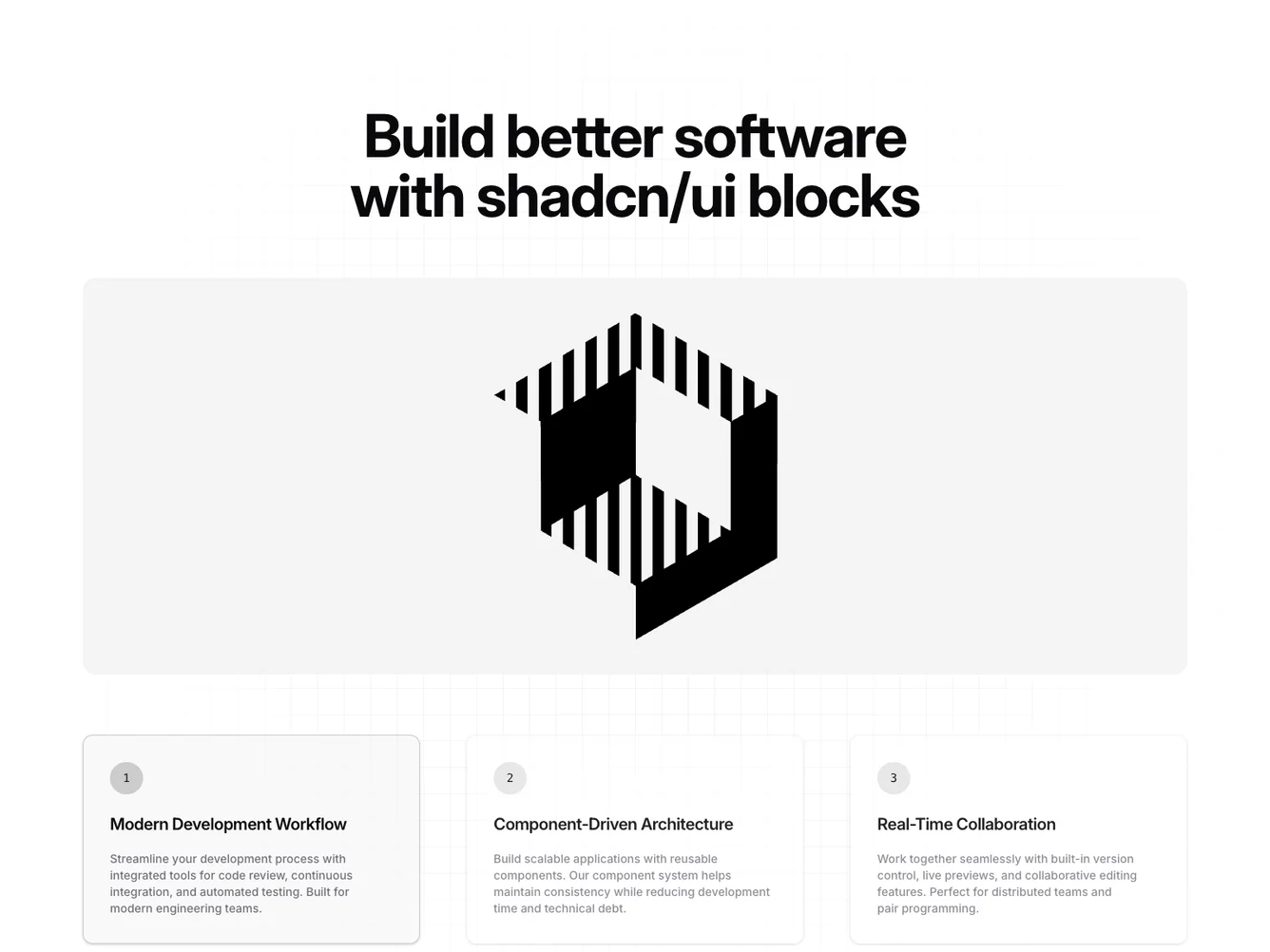
The Feature156 component offers a dynamic and visually engaging presentation for displaying key features of a product or service with the use of a tab navigation system. At its core, this shadcn block uses tabs combined with vibrant imagery and descriptive text to provide users with an intuitive way to explore different segments of content, enhancing the overall user experience.
Delving deeper into its mechanics, the component employs a set of tabs that reveal various content sections, each linked to a specific integration. These sections are paired with compelling visuals and concise descriptions, designed to convey the essence of each integration feature effectively. The layout includes a grid pattern background to add a subtle aesthetic dimension, and a central image display area where users can view an enlarged version of each feature when its corresponding tab is activated. This interactive design approach not only highlights the adaptability of shadcn ui blocks but also ensures content is presented in a consistent and manageable way.
Dependencies
| Package | Type |
|---|---|
| react | NPM |
tabs @shadcn | Registry |
