Feature 206 block design & features
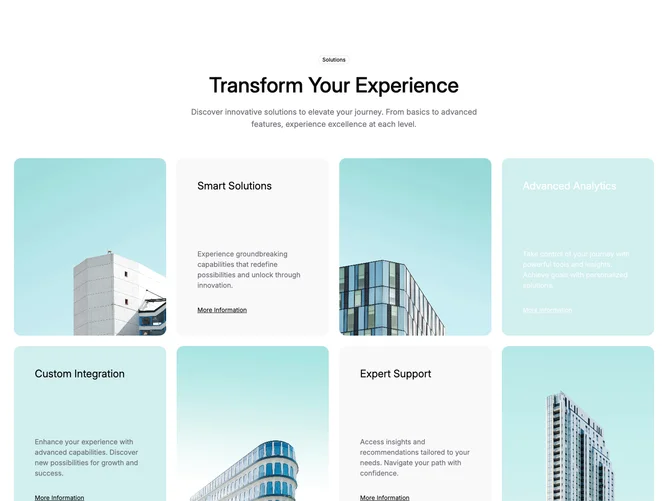
This section is built with shadcn/ui using a badge, large heading, and supporting paragraph centered above a responsive grid. Below that, square photos and padded panels alternate in a bento-style rhythm. Each panel stacks a subheading, muted body text, and an underlined text link.
Looking at the surfaces, the layout mixes rounded square imagery, soft muted panels, and mint-tinted blocks with white type on one tile to break the rhythm. Corners stay rounded throughout and spacing between blocks stays generous. The composition is mostly static aside from normal link hover behavior.
The result reads as a modern marketing grid with a calm palette and clear hierarchy between the hero line of copy and the feature tiles. The alternating image and text cards feel like a standard but well-executed features pattern rather than an experimental layout. Complexity is moderate and mostly content-driven, since each tile needs its own photo, headline, copy, and link target.
On smaller widths the grid stacks in a defined order so images and panels still read in pairs before the layout widens again.