Feature 164 block design & features
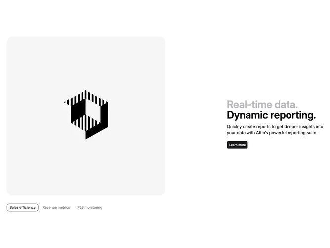
Feature164 is a client-side tabbed section built with shadcn/ui Tabs and Button. The left column swaps among three integration-style panels, each showing a square image with heavy rounding while a horizontal list of small triggers sits beneath the media. The right column vertically centers a two-line headline where the first clause uses muted color, a short paragraph about reporting, and a primary button labeled Learn more.
Visually the layout is split evenly on large screens with plenty of whitespace, bordered pill triggers, and a primary-colored outline state on the active tab. Imagery fills rounded frames without extra frames beyond the tab chrome.
The block sits in a familiar SaaS storytelling pattern: selectable proof thumbnails beside benefit copy. Complexity is moderate thanks to local state syncing trigger styling with the active tab index and the three static data objects feeding both labels and image URLs.
The stack column stays readable on narrow widths before the two halves align side by side from the large breakpoint.