Contact 11 block design & features
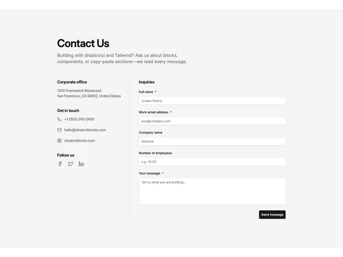
Contact11 opens with a centered title and short intro, then splits into two columns built with shadcn/ui on wide screens. The left stack lists office address, two labeled inboxes for Careers and Press, then social icons. The right column is an inquiry form with name, work email, optional company and employee count, and a message area.
On large breakpoints a single vertical rule separates the columns on an otherwise quiet background. Section labels read in semibold with muted supporting lines. Icons stay subdued until hover, inputs follow default field styling, optional prompts are spelled out, and the submit button sits at the trailing edge.
The layout feels restrained and corporate: equal weight on routing people to the right inbox and capturing a structured note. The divider makes the split obvious without extra ornament.
When space tightens, the divider yields and the stacks flow in one column so contact paths stay above the form.