

Community 3 block design & features
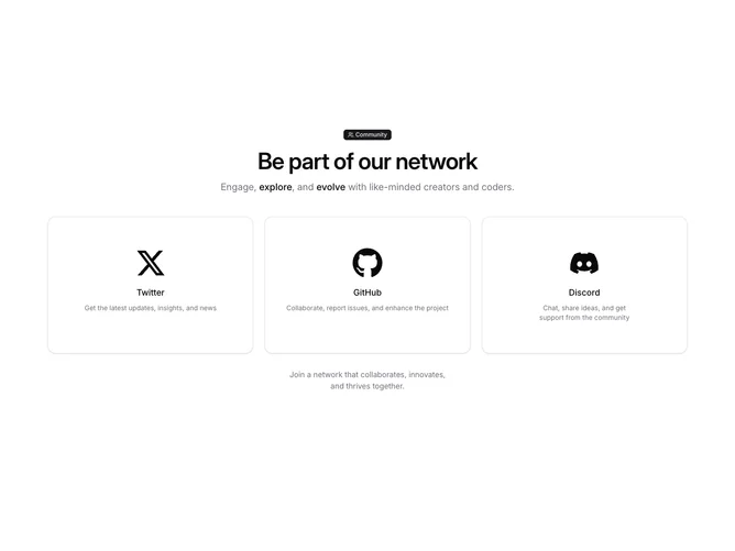
Community3 is a community section built with shadcn/ui Badge and Card primitives. The top stacks a pill badge with a users icon and the word Community, a large semibold headline, and a sentence where two words pick up stronger foreground weight. Below, three equal cards sit in a grid that is one column on small screens, two on medium, and three on large; each card links through a tall padded hit area with a big brand icon, a platform label, and a short muted explanation for Twitter, GitHub, and Discord.
Rounded cards lift slightly on hover via a modest shadow while icons scale up on extra-large breakpoints. Type scales up for the headline at wider widths, and the supporting line recenters on medium and up while staying left-aligned on the smallest width.
Overall the block feels polished and product-marketing oriented without extra chrome beyond the cards themselves. It is moderately elaborate because of the responsive type steps, hover shadow, and the optional extra muted sentence that only appears on extra-large screens under the grid.
That extra-large-only line is easy to miss in screenshots taken on smaller breakpoints; if you need that copy visible everywhere, you would adjust the visibility classes in the source.