Cta 30 block design & features
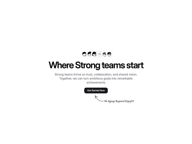
Cta30 is a centered collaboration teaser built with Shadcn UI that opens with a horizontal cluster of overlapping bordered avatars sized well above typical chips. Below sits a tight headline and muted supporting paragraph capped by a rounded rectangular primary button. An SVG scribble anchors diagonally beneath the button group while a handwriting-styled caption sits beside it to reinforce low-friction signup messaging baked into the demo copy.
Contrast stays neutral overall so personality comes from avatar photography and the informal annotation treatment rather than saturated fills. Negative positioning pulls the scribble and caption outside the strict grid to feel handmade against otherwise orderly spacing.
The tone reads playful product marketing compared with austere enterprise CTAs thanks to the handwriting motif and stacked faces implied as a team. Complexity is moderate because you must supply credible portraits and rewrite both headline and caption to match your brand voice.
Layout remains single-column at every breakpoint with typography scaling up on large screens so the hero sentence stays the focal point without introducing secondary columns.