
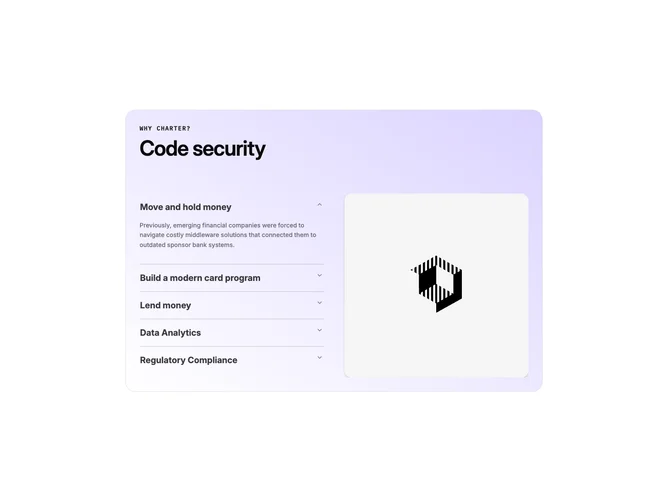

Feature 192 block design & features
This block is built with shadcn/ui Accordion and local state to keep imagery aligned with the expanded item. A mono label and large display heading introduce the section inside a rounded border shell that uses a subtle diagonal wash plus a faint repeating plus-sign texture in the background.
At desktop widths the interactive column sits on the left: each trigger line is a bold title; expanding reveals dense body copy and, on phones only, a rounded image card. On tablet and up, a second column reserves a tall rounded image that swaps when accordion selection changes, so the visual anchor always tracks the narrative.
Styling leans fintech-marketing: bold triggers, muted long-form text, soft borders that reference light and dark line colors, and shadowed photography. The implementation complexity is moderate because it coordinates accordion value changes with React state and duplicate mobile imagery.
The demo copy is finance-themed; swapping your own feature titles, essays, and screenshots is the main integration task.