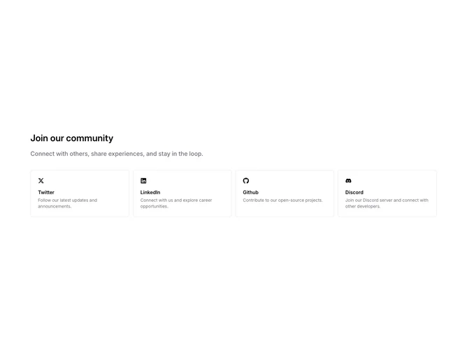
Community 2 block design & features
Community2 is a four-destination social grid built to read correctly alongside shadcn/ui border and muted-foreground tokens even though the JSX is layout-only. It opens with a section heading and a short supporting paragraph in medium weight muted text, then places Twitter, LinkedIn, GitHub, and Discord in a grid that steps from one column on small screens to two on medium and four on large. Each cell is a bordered, rounded rectangle: icon and a small ArrowUpRight on the first row (the arrow slides in on hover), with a bold platform title and a concise description beneath.
Visually the cards stay on a light background with hairline borders and muted secondary text. The hover state is the main motion: the corner arrow fades and translates into place while the card remains flat without heavy shadows.
The layout reads as a familiar marketing grid of social proofs rather than a dense dashboard. Moderate complexity comes from the four parallel content objects (title, description, URL, icon) you would replace for your own channels.
Spacing is roomy between the intro and the grid, and the cards keep even internal padding so the block still scans clearly when only one column is visible.