
Compare 4 block design & features
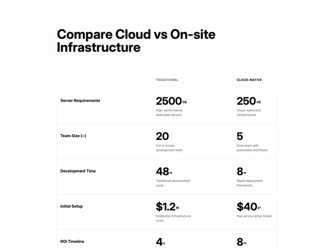
Compare4 is a stacked comparison narrative built with Shadcn UI. A large title spans the top, then column labels introduce “Traditional” versus “Cloud-Native.” Each dataset row shows a metric name on the left and two large numeric readouts with superscript units and short descriptions in muted text. The rows sit inside a rounded white card on a soft muted backdrop, and a footer block adds three small disclaimer lines before a right-aligned button that includes a trailing arrow icon.
Row hover shifts the background slightly and nudges text toward full foreground color on the cloud side toward accent styling, which gives scan-friendly feedback without motion beyond color. Numbers scale up on wider breakpoints, so the block feels typographic and poster-like on large screens.
The tone is enterprise and analytical: uppercase micro labels, strong weight on figures, and footnotes that signal real-world variance. Complexity is moderate and mostly data-driven; you replace the sample metrics and copy while the layout holds the story.
On smaller widths the grid compresses but keeps the two-value structure per row, and the call to action remains full width within the footer stack until the layout widens.