Shadcn UI Product Card Blocks, Sections & Components
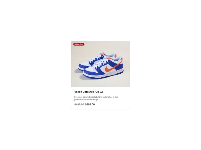
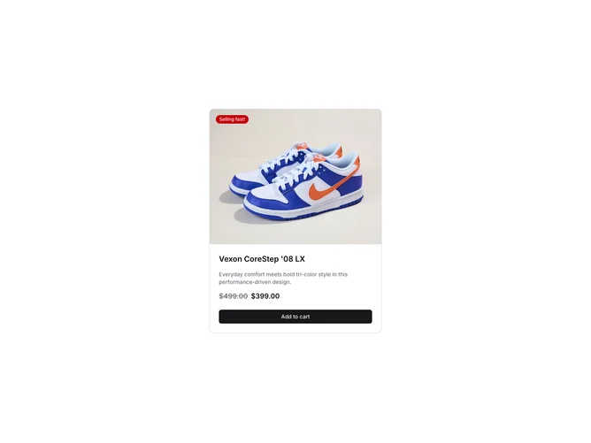
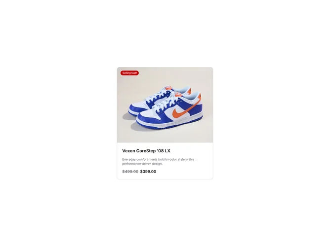
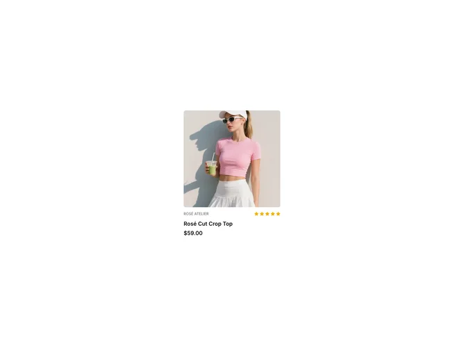
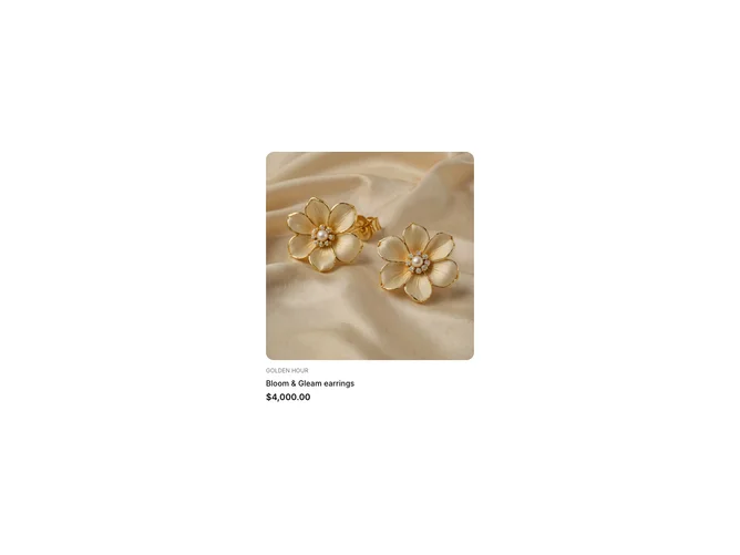
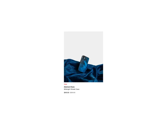
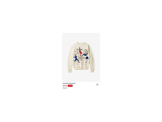
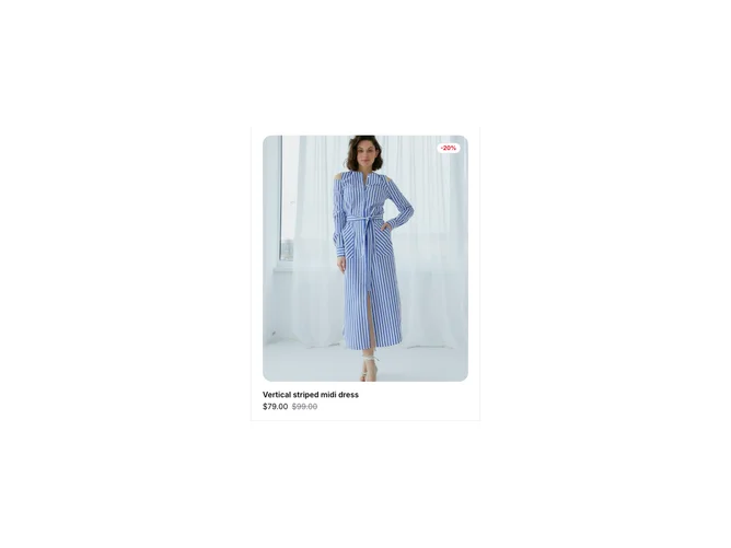
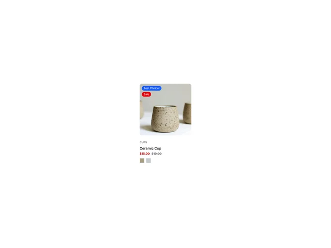
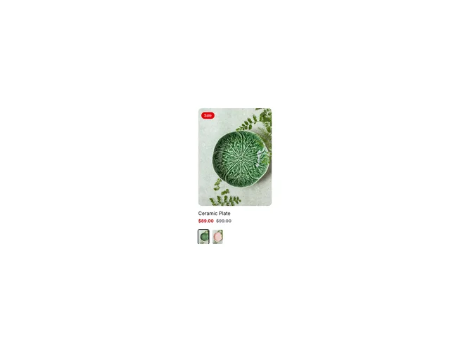
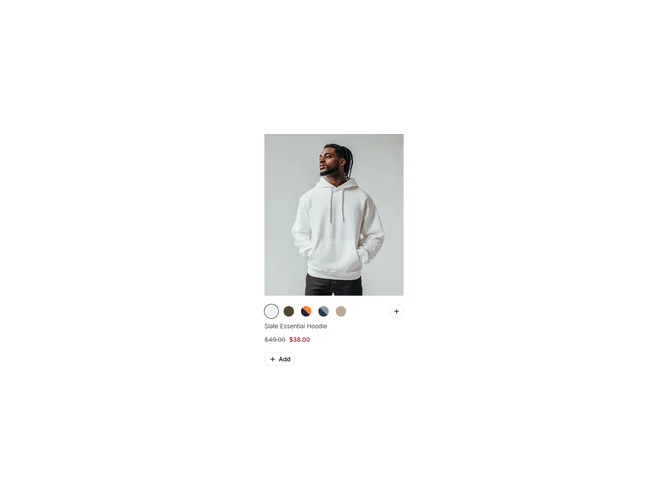
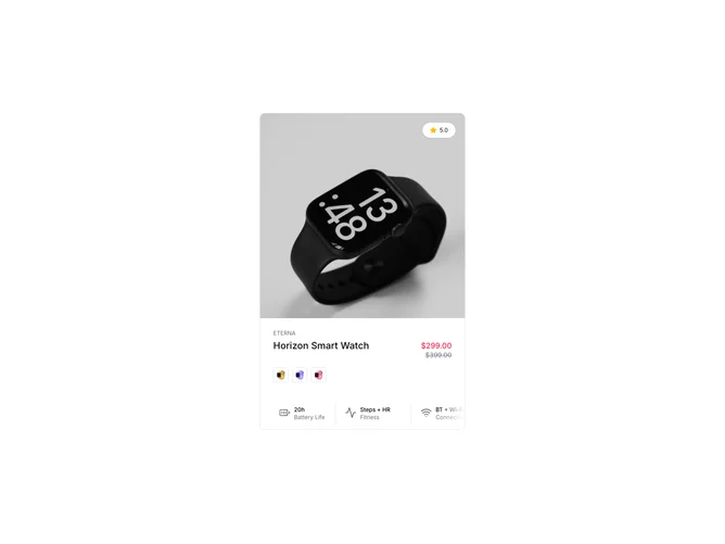
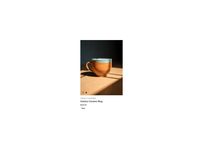
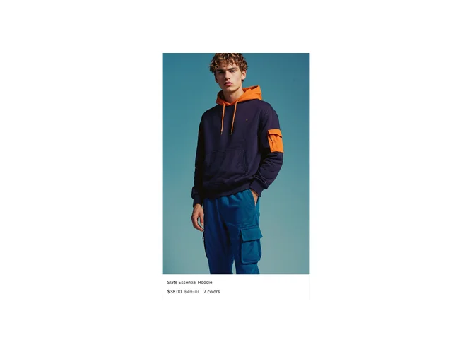
Product Card blocks are dedicated sections of a webpage focused on product card content. They appear on landing pages, product pages, and marketing sites as key elements that communicate value and drive user engagement.
Each block is a self-contained React component which you can copy/paste the code or install via the shadcn CLI. You own the code and can modify however you like, or us AI and LLMS to quickly change the design.
Our product card blocks combine headlines, supporting text, images, icons, CTA buttons, and responsive layouts. Each block is designed with clear visual hierarchy and consistent spacing to integrate seamlessly into any page structure.