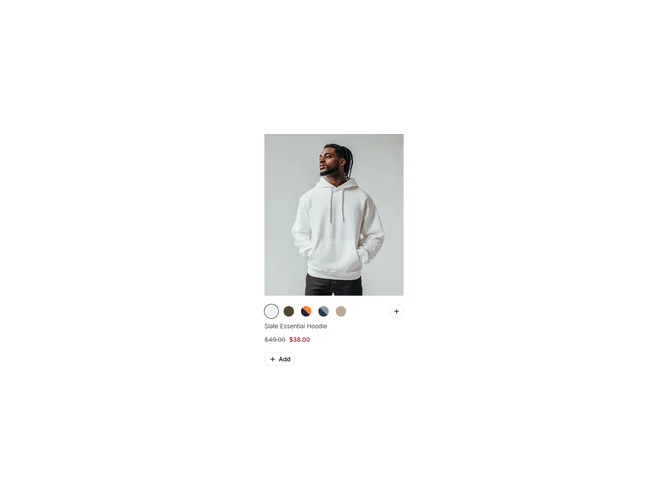
Product Card 21 block design & features
ProductCard21 is a single-product card built with shadcn/ui for apparel or any SKU with colorways. The image area can show a second photo on hover when two images exist for the active color. Color swatches sit above the title: a radio group of circular labels with tooltips, plus a collapsible section that reveals additional swatches beyond the first row. Title links through, price shows sale and regular when both exist, then a small outline add button with a plus icon.
Layout is vertical and catalog dense: muted text for secondary price, small circular swatches with ring selection state. Collapsible keeps long variant lists from overwhelming the card on first paint.
Moderate complexity driven by variant data: each color needs its own image set and label. Good fit for fashion grids where one card must carry full variant picking without opening a modal. Less suited when you need size matrix and color in one glance without progressive disclosure.
Card width is constrained so it tiles cleanly in responsive grids.