Product Card 5 block design & features
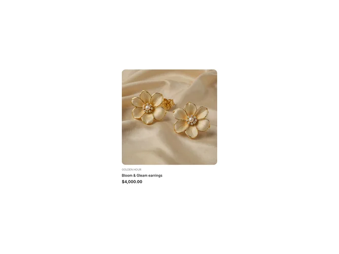
The ProductCard5 shadcn component is a sophisticated block designed to present product information in a visually appealing way. Its primary role is to display essential details about a product, such as the name, price, image, and collection, while also enabling an interactive link to further product information. This component stands out through its integration of a nested card structure, ensuring a balanced and clean presentation of both textual and visual data.
With a seamless combination of an image and textual overlay, ProductCard5 utilizes an aspect ratio to maintain the aesthetic integrity of the product imagery, allowing for a tailored view that aligns with the overall design intent. The use of shadcn UI components like Card, CardHeader, and CardContent ensures the content is organized logically, enhancing readability and user engagement. The inclusion of the Price component, alongside PriceValue, provides a dynamic representation of product pricing, subtly allowing for comparisons between regular and sale prices. This component is particularly unique due to its thoughtful design, which emphasizes both form and function, making it an ideal choice for showcasing products within a shadcn collection.