Product Card 9 block design & features
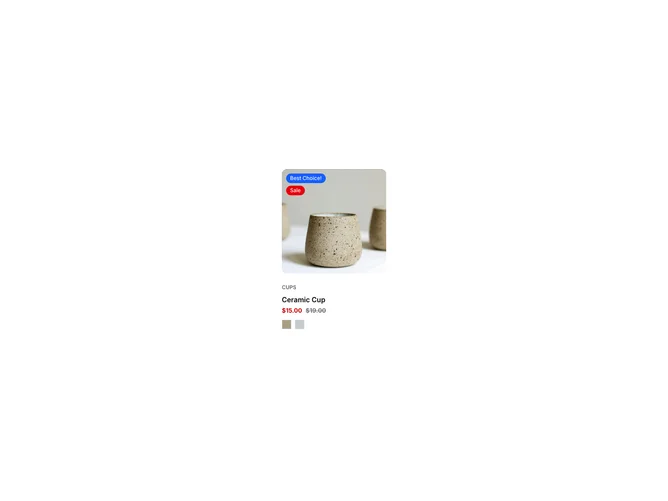
The ProductCard9 shadcn component provides a dynamic and visually appealing way to display a product's information on an e-commerce platform. It handles important elements such as product images, pricing, variant colors, and badges, which are all organized within a visually distinct card format. This card integrates seamlessly into larger product listings, maximizing space and providing customers with all necessary information in a concise and attractive format. By leveraging the shadcn UI framework, it ensures a modern styling that enhances user engagement.
Delving deeper into its features, ProductCard9 showcases a robust design with interactive elements that enhance user experience. This shadcn block emphasizes a smooth transition between product variant images as users hover over different color options, creating an immersive and responsive browsing experience. The display of product prices, with emphasis on discounts, adds an additional layer of information — further enriching the component’s utility. Additionally, thoughtful integration of badges, positioned brightly and prominently, captures the user’s attention to highlight special product features. By using this shadcn ui component, developers can effortlessly incorporate a dynamic and highly functional product display while maintaining a uniform and aesthetically pleasing design across the application.