Product Card 3 block design & features
The ProductCard3 component serves as a dynamic and visually appealing way to showcase product information. It combines an image, title, description, price, and a call-to-action button, all encapsulated within a card layout. This component effectively highlights special product attributes like discounts or promotional badges, making it a versatile choice for e-commerce interfaces. Its intuitive design ensures that essential product details are prominently displayed, helping users make informed purchasing decisions.
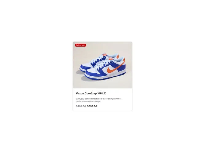
In more detail, the ProductCard3 shadcn block features a clean and modern design with a focus on product imagery and price information. The top section includes an image with an aspect ratio that maintains a consistent visual flow, paired with a dynamic badge that can highlight promotions or stock urgency. Below the image, the component provides a straightforward presentation of the product name and description, enriched with shadcn UI elements to enhance readability. A standout feature is the display of regular and sale prices side by side, visually emphasizing discounts. Additionally, a hidden interactive "Add to cart" button emerges on user interaction, encouraging engagement without overwhelming the initial view. This component's thoughtful design and strategic use of space make it stand out from typical product card implementations.