Product Card 24 block design & features
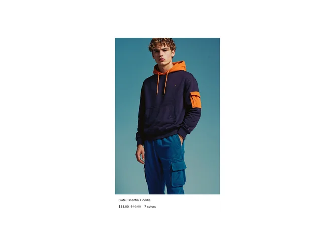
ProductCard24 is a form-heavy apparel card built with shadcn/ui, react-hook-form, and zod validation. The top is a carousel of product photos with explicit previous and next controls. Title and sale-aware price sit under the gallery. Two hinge groups drive size and color: options can show out-of-stock state, and color choices use gradient-filled circles. Submitting add to cart respects the validated selection.
The layout reads as a mini PDP embedded in a card: more vertical space than a teaser tile. Gradient swatches and disabled states make inventory differences obvious. Price typography differentiates strike and sale clearly.
Highly complex for a card component because of schema validation, stock codes, and carousel plus dual hinges. You need images per variant or color, structured option lists, and stock metadata. Best when grids must support full variant pick without navigating away.
Mobile keeps the same flow with stacked controls; the carousel remains primary above the fold.