Product Card 10 block design & features
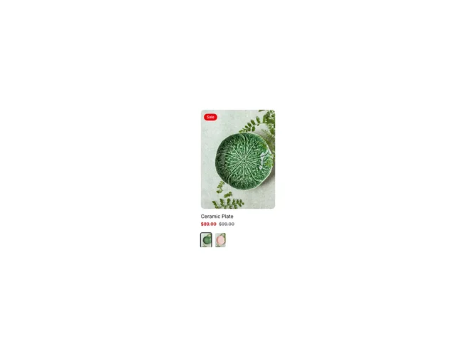
The ProductCard10 component is a sophisticated shadcn block designed for displaying a detailed product card layout. This component integrates various UI elements to provide a visually appealing representation of a product, especially focusing on product variants. It allows users to see product details, including multiple available variants, and offers the ability to interact seamlessly with the product such as adding it to a cart or viewing it quickly.
The component stands out with its meticulous design, utilizing an array of shadcn UI elements like the AspectRatio, Badge, Button, and Tooltip, ensuring a rich interactive experience. Each product card displays a product image that scales on hover, and prominently shows sales badges or stock status. Users have the capability to switch between product variants, with images updated accordingly, offering a dynamic and interactive browsing experience. Additionally, the use of customizable tooltips over variant selectors enhances the user's ability to make informed decisions quickly by simply hovering over options. The interactivity and customizable nature of this shadcn component make it a unique and versatile choice for showcasing product offerings in style.