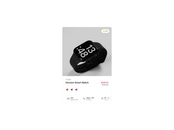
Product Card 22 block design & features
ProductCard22 is a gadget-style card built with shadcn/ui. A square image carousel loops through four photos; moving the pointer across the image divides it into thirds and snaps the carousel to the matching slide without drag handles. On hover an add-to-cart button fades up over the image. Under the media, brand link, star rating, product name, and sale-aware price appear, then a horizontal row of icon-labeled specs such as battery and connectivity, then optional small variant thumbnails.
The aesthetic is dark-on-light retail with tight typography. The zone-based carousel is the unusual interaction: it rewards exploration but assumes desktop hover; touch users still get swipe if drag is enabled elsewhere. Spec icons add a technical brochure feel.
Elaborate for a card: carousel state, pointer zones, hover-reveal CTA, and spec metadata. You need four images, a spec list, rating string, and optional variant thumbs. Strong match for electronics or wearables grids.
Narrow screens may collapse the spec row or rely on the same carousel without zone logic depending on viewport hooks in your fork.