Product Card 7 block design & features
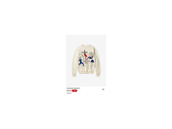
The ProductCard7 component is a dynamic product card shadcn block designed to display product information efficiently and interactively. It makes use of a flexible layout to present product details, such as the product name, image, price, and available sizes. This component is ideal for use in an e-commerce context where items need to be presented with key purchase information at a glance.
ProductCard7 stands out with its unique use of the shadcn ui framework to incorporate elements such as pricing badges, size selection through radio groups, and interactivity with buttons and forms for both desktop and mobile views. The component seamlessly integrates with form logic to allow users to select product sizes, presenting real-time stock status through tooltips. Visual design elements such as aspect ratios and actionable icons for wish-listing enhance the user experience, providing a sophisticated yet practical approach to product display. This makes it an exceptional choice for developers looking to implement a comprehensive product card display in their applications.