Product Card 2 block design & features
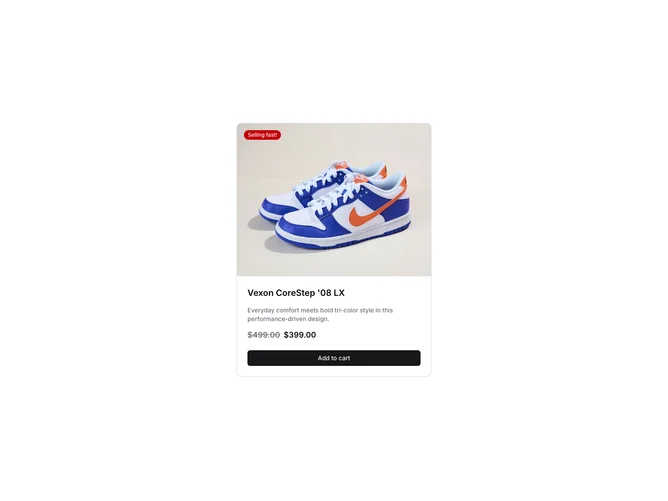
The ProductCard2 component is a versatile shadcn block designed to showcase product information effectively. It integrates seamlessly into any layout thanks to its flexible design, offering a complete overview of a product, including an image, name, badge, description, and pricing information. By presenting these crucial details in a cohesive manner, this component ensures that users quickly grasp the essential aspects of the product offered.
Delving deeper into the design, the ProductCard2 encapsulates product details in an aesthetically pleasing and functional layout. It features a prominently displayed product image with an adjustable aspect ratio, courtesy of an integrated AspectRatio component, enhancing visual appeal. The badge, another notable element, uniquely highlights the product's status with customizable text and background color. An eye-catching price section displays critical pricing information using the shadcn ui Price and PriceValue components, differentiating between regular prices and promotions with clear distinctions. A strategically positioned call-to-action button at the bottom facilitates easy user interaction, encouraging engagement. Such nuanced design elements make the ProductCard2 a distinctive choice for a shadcn component, prioritizing both form and functionality to assist users effectively in their shopping journey.