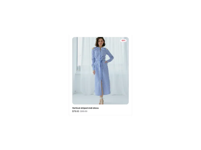
Product Card 8 block design & features
This product card component serves as an interactive and visually appealing way to display product details in an e-commerce context. It enhances user engagement by offering an immersive experience where users can view product images, ratings, sale discounts, and pricing tiers. The component's standout feature is its ability to reveal more detailed product options like size and color on interaction, leveraging a collapsible design that maintains a sleek interface while providing necessary shopping functionalities.
The component's design integrates dynamic elements such as image zoom effects and animated transitions, adding a layer of sophistication to its appearance. Its unique features include a shadcn block that enables quick navigation and selection within a scrollable area, optimizing for a full-fledged interactive shopping module. This shadcn UI component emphasizes usability by bundling a seamless blend of essential product information and user interaction mechanisms. Additionally, the integration of a form for selecting various product configurations—like size and color—differentiates it by offering a comprehensive shopping experience within a compact card layout.