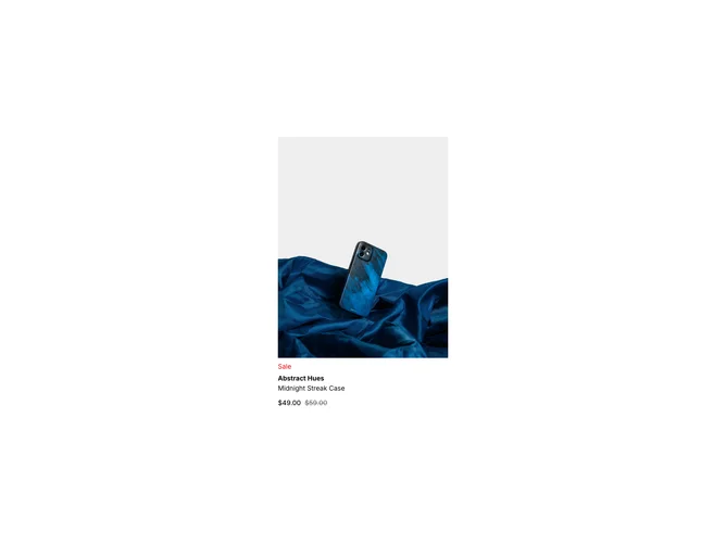
Product Card 6 block design & features
ProductCard6 is a versatile product display component that showcases a single product along with its various attributes, including the ability to select color variations. At a glance, users can view the product image, price, and availability status. Additionally, a "Quick Add" button facilitates swift product additions to the user's shopping cart directly from the card interface, streamlining the shopping experience. This card layout leverages the shadcn component library for a consistent style and interactive features, such as hover effects that reveal additional controls and information.
Delving deeper, ProductCard6 offers a dynamic interface powered by complex form management. The card adapts its display based on the product's stock status and whether it's on sale. Users can interact with a color selector to view different product variations, each with a distinct image and pricing structure. The design elegantly integrates with shadcn ui components like buttons, price display, and radio groups, enhancing both usability and aesthetic appeal. This component stands out due to its cohesive integration of interactive elements, such as image transitions and hover-revealed controls, creating a seamless and engaging user experience within the e-commerce space.