Product Card 23 block design & features
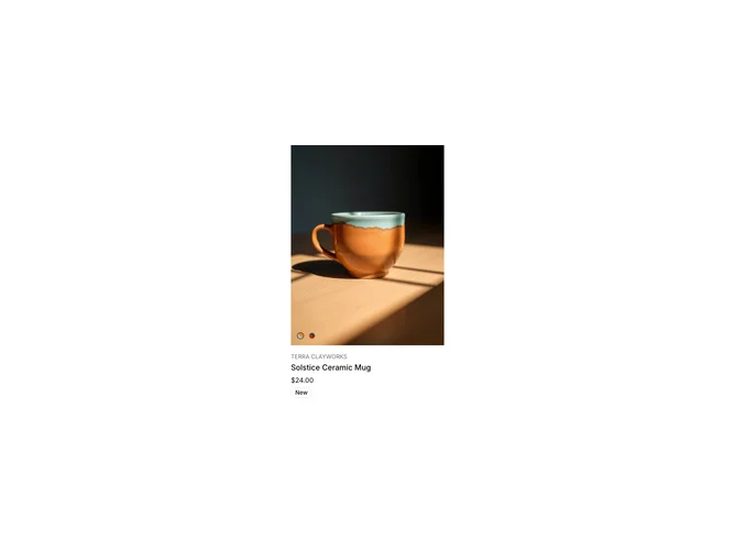
ProductCard23 is a vertical card built with shadcn/ui aimed at ceramics, decor, or small catalog items. The hero image fills a tall aspect frame and switches when the user picks a color option from a labeled radio group with circular swatches. Brand name and product title sit above the swatches; a New badge can appear beside the title. Price sits under the controls, and a slim footer row includes a search affordance for store lookup.
Visually calm: neutral surfaces, emphasis on photography, small uppercase labels on swatches. The search icon is an extra utility not found on every product card pattern, which nudges the block toward discovery-heavy storefronts.
Moderate complexity: each variant needs images and hex or token colors. Simpler than multi-carousel electronics cards but richer than a static tile. Works well when you have two to four glazes or finishes per SKU.
Responsive rules keep the image dominant; controls stack with comfortable touch targets on phones.