Product Card 1 block design & features
The ProductCard1 component offers a comprehensive presentation of product details in a sleek, compact format. This component effectively integrates essential product information such as the name, image, pricing, and promotional badges, all within a beautifully designed container. It enhances user interaction by providing a hover effect that subtly alters opacity, inviting users to explore further.
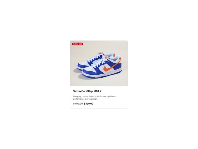
Delving into the component's structure, ProductCard1 utilizes a shadcn block layout to display a single product snapshot prominently. The visual emphasis is on the product image, ensconced within an AspectRatio block, ensuring optimal presentation across varied display conditions. A distinctive feature is the customizable badge, strategically positioned to draw attention and convey urgency with messages like "Selling fast!" set against a vibrant background. The card's content section retains focus with clear typography, showcasing the product's name, description, and price in both regular and sale formats. The versatility and attention to detail in this shadcn ui component make it a standout choice for highlighting promotional items effectively.