Feature 211 block design & features
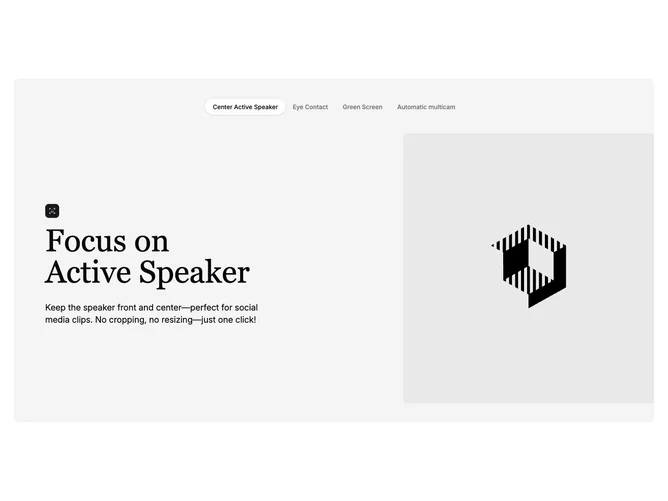
This tabbed marketing section is built with Shadcn UI tabs plus a scrollable pill tab list component. Tabs sit above the content area inside a rounded muted container. Each panel splits into a text stack with a square primary-colored icon tile, a large serif title, an enlarged body paragraph, and sometimes a wide primary button, beside a media area that swaps between a single tall crop, a scattered multi-photo collage, an offset wide frame, or a two-by-two grid.
Styling leans on generous padding inside the muted shell, rounded triggers, and sharply cropped imagery with rotated cards where variants demand it. Motion is mostly implicit through tab switching rather than scroll animations. Typography contrasts the serif display heading against plain sans body copy.
The block feels polished and product-demo oriented, with a video-editing story in the placeholder data. Its standout quality is the four distinct image compositions driven by data rather than one static visual. Expect moderate to high content work: icons, tab labels, headlines, summaries, optional links, and several image assets per tab.
On smaller breakpoints the grid stacks so text comes before imagery while the tab list remains horizontally scrollable.