Contact 9 block design & features
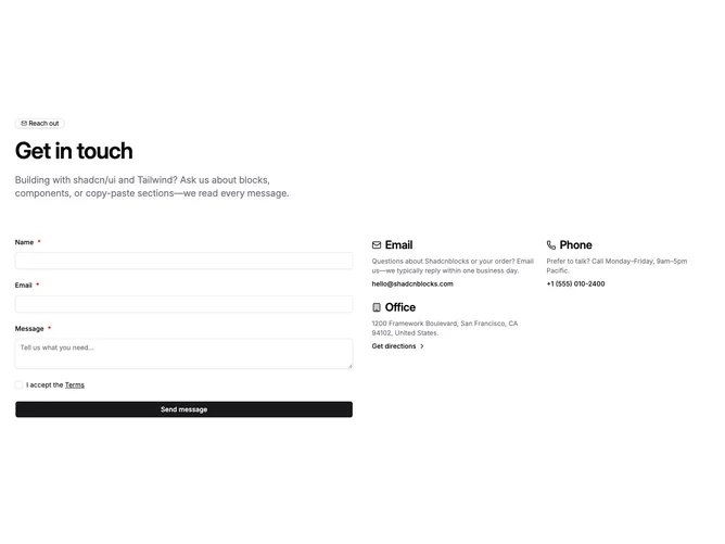
Contact9 builds a marketing-grade contact band with Shadcn UI badge, typography, inputs, checkbox, and button patterns. The upper stack pairs a mail icon outline badge with a large heading and wide supporting paragraph, then a wide row splits into a form column and a companion column rendered as a two-wide grid on large screens that maps structured contact cards with icons, muted descriptions, and actionable mail, tel, or directions lines depending on the data you pass in.
Inputs adopt bordered backgrounds that match card surfaces, the terms row pairs a checkbox with linked legal copy, and submission swaps to spinner state with labels you can customize alongside the other strings.
The layout balances inquiry capture with visible alternate channels, and the required terms step adds a slightly more formal tone than a bare message box.
On small screens the form stacks above the method grid so scrolling follows natural task order.