Pricing 30 block design & features
The component is a comprehensive pricing table component designed to showcase multiple plans for a service or product, each with its own set of features. The component is divided into mobile and desktop views, providing a seamless experience across device types. It uses a collapsible interface for mobile devices, allowing users to toggle between different plans easily, and a grid layout for desktops, displaying all plans and features side by side.
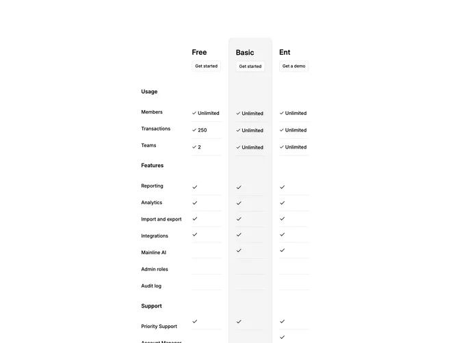
In more detail, the component leverages shadcn UI features to organize and display various pricing tiers: Free, Basic, and Enterprise. Each plan includes specific usage limits, features, and support levels, providing a clear comparison to help users select the best option for their needs. The design integrates interactive elements such as collapsible components and buttons that encourage user engagement. Additionally, the pricing plans are structured to highlight the "Basic" plan as the most prominent choice, aided by the visual distinction with a muted background and border for desktop users.