
Compare 5 block design & features
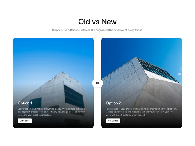
Compare5 contrasts two paths using photography and overlays, built with shadcn/ui. The header centers a large display title (“Old vs New”), a muted supporting sentence, then a two-column grid of tall rounded image panels. Each card fills with a hero photo, fades to black through the lower third with a light blur on the overlay, and anchors white title text, descriptive paragraph, and an outline button on the bottom. A circular “OR” badge absolutely centers between the columns to mark the fork in the narrative.
Visual weight sits on imagery and contrast: white type on dark scrims, bold OR chip with shadow lifted above the gutter, and roomy padding that scales upward on larger breakpoints. The first card picks up an accent-tinted frame while the second stays neutral, which quietly differentiates sides without extra chrome.
This is image-forward marketing more than dense comparison data. Complexity is modest and content-heavy: compelling photos plus two tight stories decide whether the section works. Interaction is minimal and static aside from hover on buttons.
Wide layouts hold two columns while narrow screens stack the cards vertically; the OR badge stays visually centered relative to the pair so it still reads as a junction point after stacking.