Feature 191 block design & features
Feature191 is a marketing feature grid built with shadcn/ui on an accented section surface. A centered intro stacks an outline badge with icon, a large balanced headline, and a muted supporting line capped for readability before the cards.
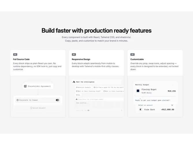
Three bordered cards sit on bg-background with shadows. Each card leads with a compact numbered badge in monospace styling, then a semibold title and muted description. The media sits beneath as a full-width image with fixed aspect ratio, rounded bottom corners, and border treatment consistent with placeholder specs.
The block reads as a stepped onboarding or capability narrative without carousel chrome. Moderate layout complexity with fixed three-up desktop columns and two columns through tablet. Defaults merge the shared feature-card-list placeholder pack for titles and copy while injecting step numbers and raster placeholder photography paths.