
Cta 14 block design & features
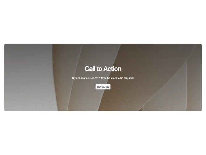
Cta14 is a single-column call to action built with shadcn/ui, placing a background photograph inside a rounded container panel. A vertical gradient overlay darkens from the top down, giving the centered headline strong contrast while letting the lower portion of the image show through more clearly. A description line and a single secondary button complete the text stack.
The panel has rounded corners and sits inside the page container, creating visible margins on both sides. The gradient transitions from a darker foreground tone at the top to a lighter wash at the bottom, producing a natural falloff that keeps the text readable without flattening the entire photograph. Typography is semibold with tight tracking on the headline, and the body text uses a medium weight at a smaller scale.
This is a straightforward, low-complexity block that relies on one background image for its visual weight. The contained layout with rounded corners gives it a card-like feel rather than a full-bleed editorial look, making it a safe default choice for sections that need a visual break without dominating the page.