Feature 171 block design & features
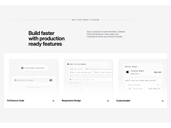
Feature171 wraps feature-card-list content in a secondary-tinted section built with shadcn/ui Card primitives. A horizontal dashed line spans the container with an absolutely centered uppercase mono label that hides on the smallest breakpoint, establishing a deliberate engineering motif before a two-column grid presents the main heading and supporting paragraph.
The Card body lays out up to three feature slices in one row on large screens: each slice shows a rounded-top image with a bottom gradient scrim, then a flex row pairing the feature title with an ArrowDownRight icon inside a link-styled row. Between slices, custom dashed dividers flip between vertical desktop separators and horizontal mobile separators so the rhythm stays continuous.
Overall the aesthetic is structured and slightly technical, bridging marketing copy with connector-line diagram language. It is moderately complex because of the custom dashed SVG-like gradients, gradient masks, and breakpoint-specific divider orientation, alongside three image tiles worth of real content.
Large layouts keep all tiles in a single horizontal card; narrow layouts stack tiles vertically while preserving dashed breaks between entries.