Cta 21 block design & features
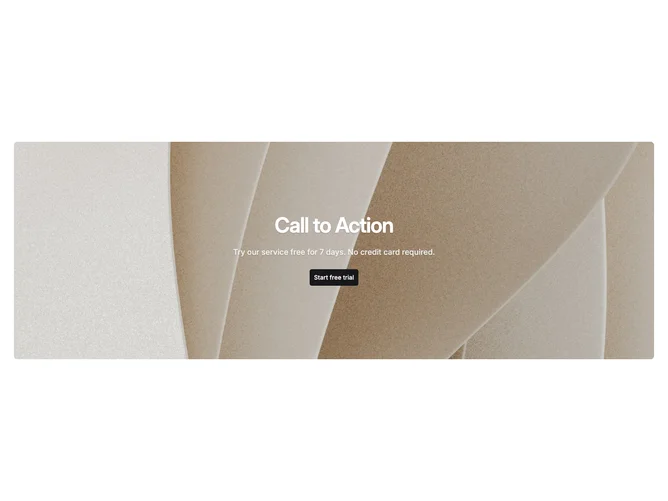
Cta21 is a single-column call to action built with shadcn/ui, placing a background photograph inside a rounded container panel without any overlay element. Text legibility comes from a subtle drop shadow applied directly to the text rather than darkening the image, so the photograph shows through at full brightness. The centered stack holds a headline, a softer body line at reduced opacity, and a single primary button.
The panel uses rounded corners and fits within the page container. Because there is no overlay between the image and the text, the block reads as lighter and more open than overlay-based variants. The headline uses semibold weight with tight tracking and text-balance for even line breaks, while the description sits at a slightly lower opacity. The primary button provides a solid anchor point at the bottom of the stack.
This is a minimal block that works best with photographs that have naturally darker or more uniform mid-tones where the text shadow alone provides enough separation. Brighter or busier images may need more contrast, making the overlay-based alternatives a better fit in those cases.