

Feature 184 block design & features
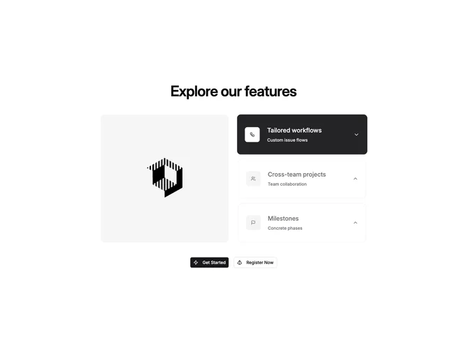
This block is built with shadcn/ui Tabs and Button. A section heading sits above a layout split on large screens: one side is a fixed-height rounded image frame whose source follows whichever feature tab is active; the other side is a vertical stack of full-width tab triggers. Each trigger shows an icon in a muted tile, a title line, a short supporting line, and a chevron that rotates when selected.
The image panel uses rounded corners and object-cover filling. Inactive triggers read as bordered cards on a light surface; the active state fills with the primary color, adds shadow, and slightly scales the card forward. Typography is headline-forward in the tab labels with smaller muted helper text. The bottom row centers two actions (primary and outline) with small leading icons.
The pattern is modern and product-marketing oriented: strong click feedback on the tab cards makes the interaction obvious without extra chrome. Complexity is moderate: you supply tab labels, short descriptions, icon elements, image URLs, and button labels.
On small viewports the grid stacks naturally so the image and tab list still read as one story before the button row.