Feature 160 block design & features
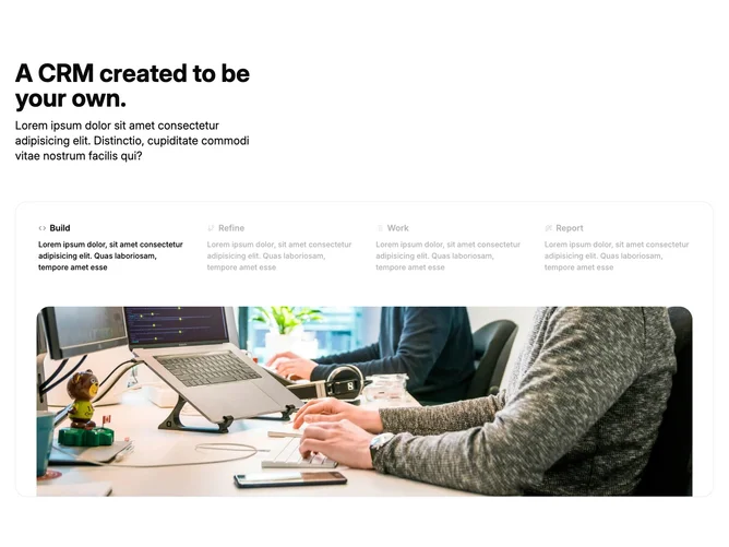
Feature160 is an advanced tab motif built with shadcn/ui, presenting multiple milestones or integrations inside a tiled tab matrix alongside a spotlight image. Each selectable cell carries an icon, short title, and description; activating a cell swaps hero artwork and explanatory copy beside the dense grid rather than burying visuals below the fold.
The visual tone stays crisp and analytic: visible dividers reinforce the lattice, typography compresses secondary lines, and the hero side receives softer framing so scanned eyes land there after picking a tab.
This block skews moderately complex owing to coupling four parallel narratives plus artwork swaps. Compared with minimalist tab bars, it signals depth and completeness for onboarding stories.
Populate consistent icon metaphors plus distinct hero frames for every tab state. Narrow layouts should stack tabs above the illustration to avoid unusably small grid cells while preserving readability.